Indoor navigation for places that are built in layers.
I explored how Google Maps could help people understand level changes, transfers, and accessible routes inside complex buildings.
Google Maps works well when a route can be understood on one flat surface. Inside transit hubs, museums, airports, and large public buildings, that model begins to break down. This exploration adds level-aware route previews and indoor guidance without asking users to learn an entirely new navigation product.
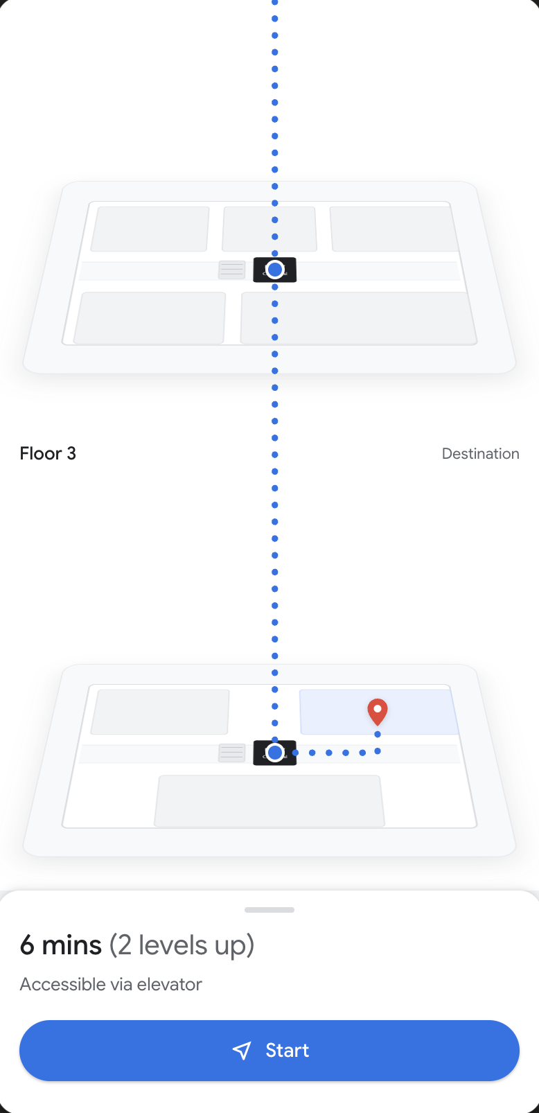
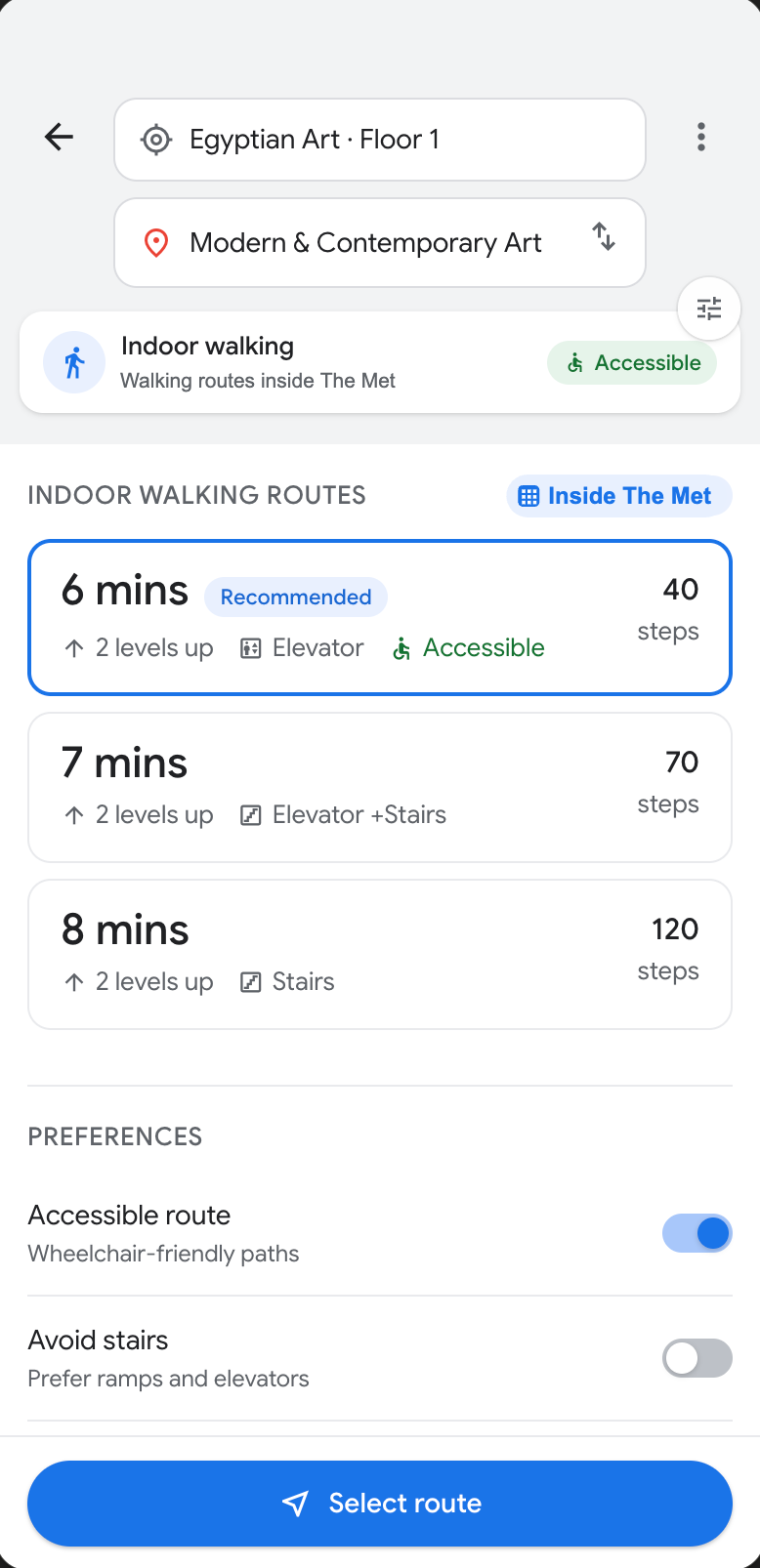
- ALevel changes are shown before you start walking.
- BElevator and accessibility are part of route selection.
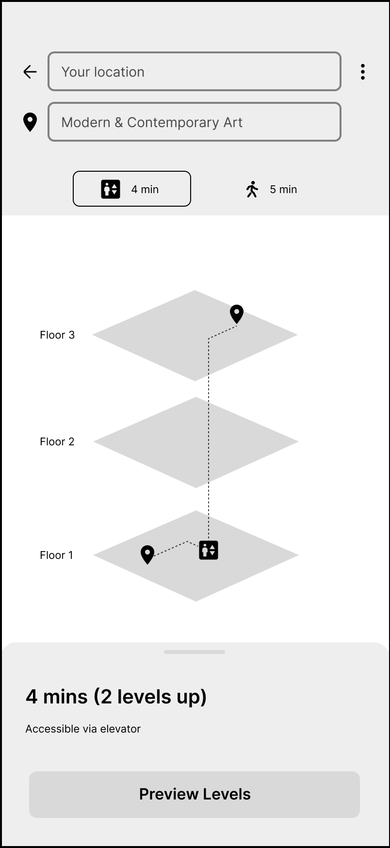
- CFloors are previewed as one connected route.
It lives inside the Google Maps directions you already use — not in a separate app.
A map that's flat can't explain a building that isn't.
I kept running into the same moment: I'd follow directions to a place, arrive at the front door, and then be on my own. Inside a museum, a transit hub, or an airport, the route I trusted outside suddenly stopped helping. When I looked closely, the gap always came down to the same few things a flat map never shows.
The problem wasn't a lack of directions. It was that the directions never let me picture how the floors connected before I committed to a route.
Designing inside a product people already trust.
I decided early that this shouldn't be a new app. If indoor navigation belongs anywhere, it's inside the tool people already open when they're lost. That choice set the constraints I designed against.
- 01Keep the map as the main canvas. The feature shouldn't turn Google Maps into a separate indoor-navigation app.
- 02Use familiar patterns. Search, place pages, route selection, map pins, bottom sheets, and navigation controls should stay recognizable.
- 03Don't add another permanent tab. Indoor guidance should appear only when it's relevant to the current place or route.
- 04Keep information progressive. Understand the overall level change first, then get detailed instructions while walking.
- 05Support accessibility before the route begins. Elevator availability and stair requirements should be visible during route selection — not hidden in settings.
Walking one person through one building.
They're in the Egyptian Art galleries and want to reach Modern and Contemporary Art — two levels above, in another wing.
What Maya needs- To know the destination is two levels up
- An elevator-accessible route
- How long the transfer will take
- To not discover a level change at a stairwell
- To stay oriented in an unfamiliar building
The current route tells her where to go, but never helps her picture how the floors connect.
Where could this actually live in Maps?
Before committing to a direction, I roughed out how indoor guidance could fit into the Google Maps flow — from the place page, to switching levels, to previewing how floors connect. These are intentionally low-fidelity.
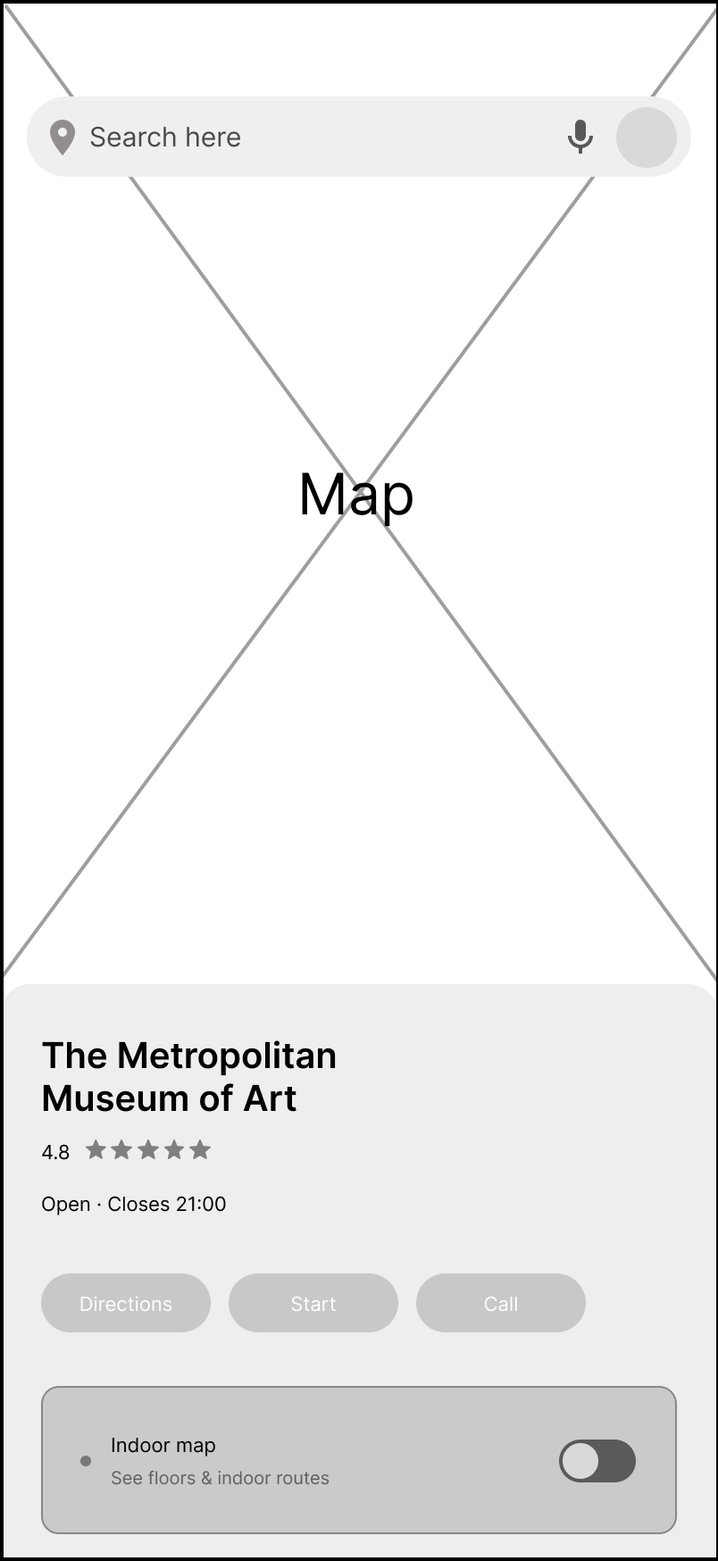
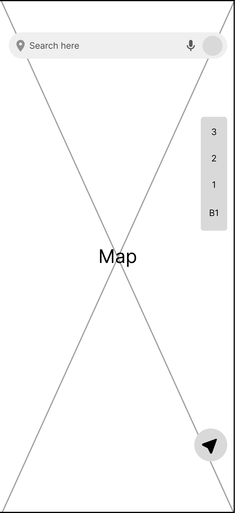
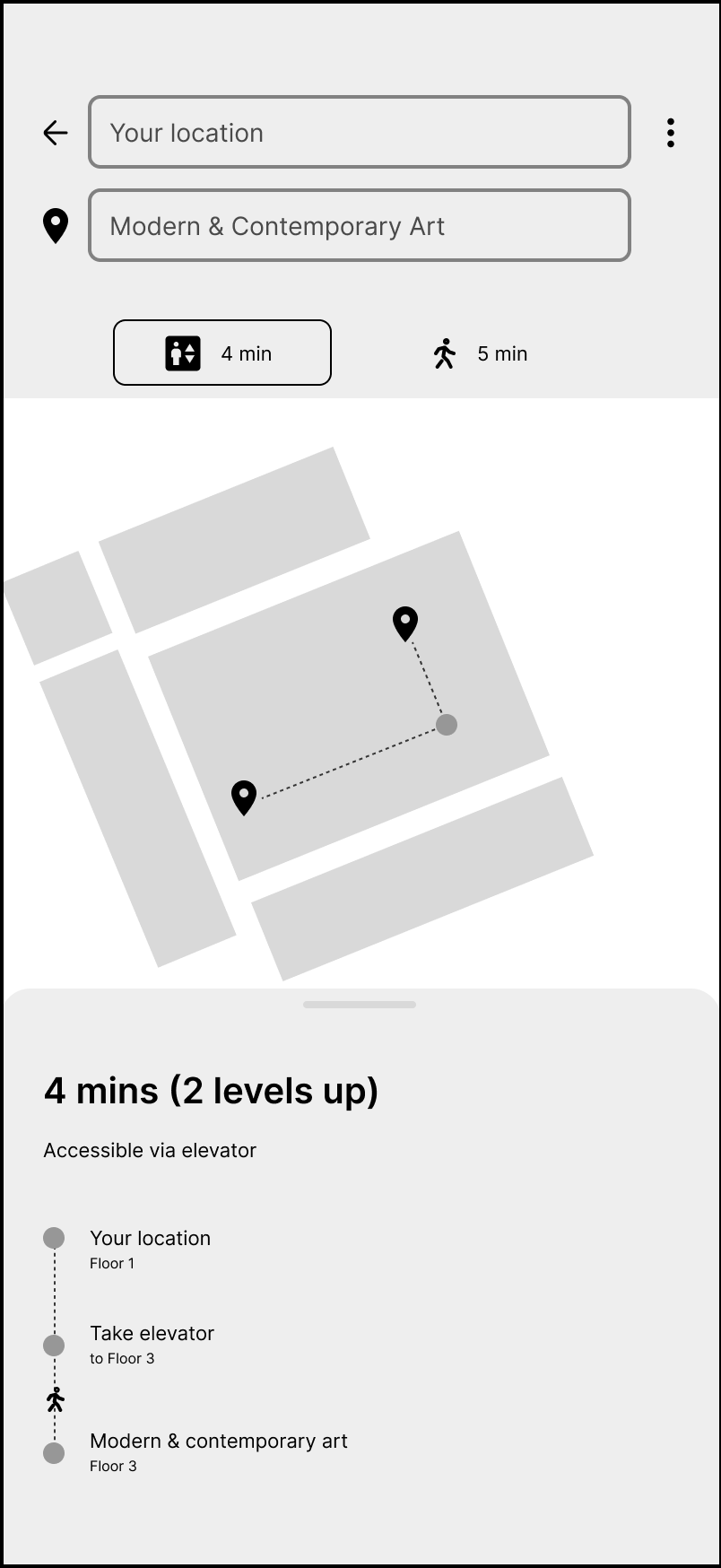
It adds a global navigation destination for something that's only relevant inside certain buildings. Most of the time it would sit there unused.
Indoor guidance appears within the directions people already use. It keeps the feature contextual and leans on patterns they know.
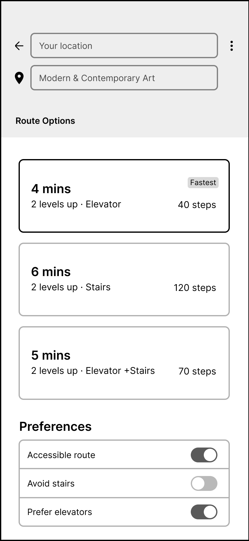
From a rough list of routes to one clear decision screen.
The route-options screen became the heart of the feature — the one moment where a person decides. I kept refining it until the level change, the access mode, and the walk time were all legible at a glance.
Four moments, from finding a destination to walking there.
Maya's route through The Met, staying inside the Google Maps model the whole way. The markers below call out which part of each screen the notes refer to.
Finding a destination inside the building
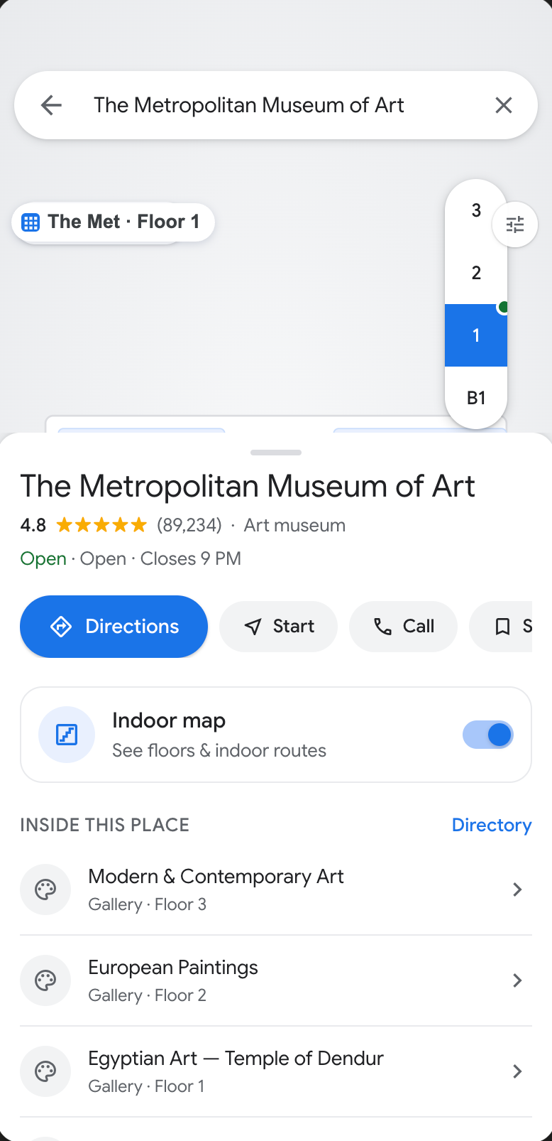
- AIndoor guidance begins from the existing place page.The "Indoor map" toggle sits in the place sheet Maps already shows.Existing Maps pattern
- BDestinations inside the building behave like searchable places.Each gallery carries its floor, so "Modern & Contemporary Art" is a place on Floor 3.Proposed indoor behavior
- CThe floor selector appears only when indoor data is available.It's contextual — not a permanent control bolted onto every map.Proposed indoor behavior
Comparing indoor routes
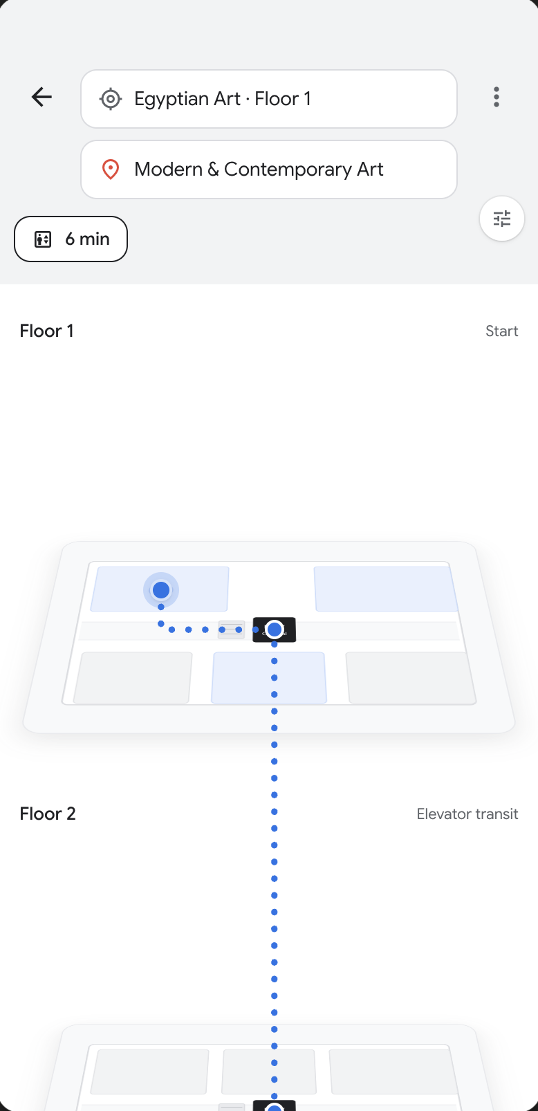
- AThe current and destination levels are established first."Egyptian Art · Floor 1" to "Modern & Contemporary Art" sits in the familiar origin/destination fields.Existing Maps pattern
- BVertical movement appears directly on each route card."↑ 2 levels up" and the access mode read alongside the walk time — no drilling in.Proposed indoor behavior
- CAccessibility is visible before the user commits.The recommended 6-minute elevator route is labeled "Accessible," and the accessible-route toggle filters to step-free paths.Proposed indoor behavior
Understanding the route spatially
The centerpieceOne continuous dotted route runs from the starting floor, through the elevator, up to the destination — so the level change is something you see, not just read.
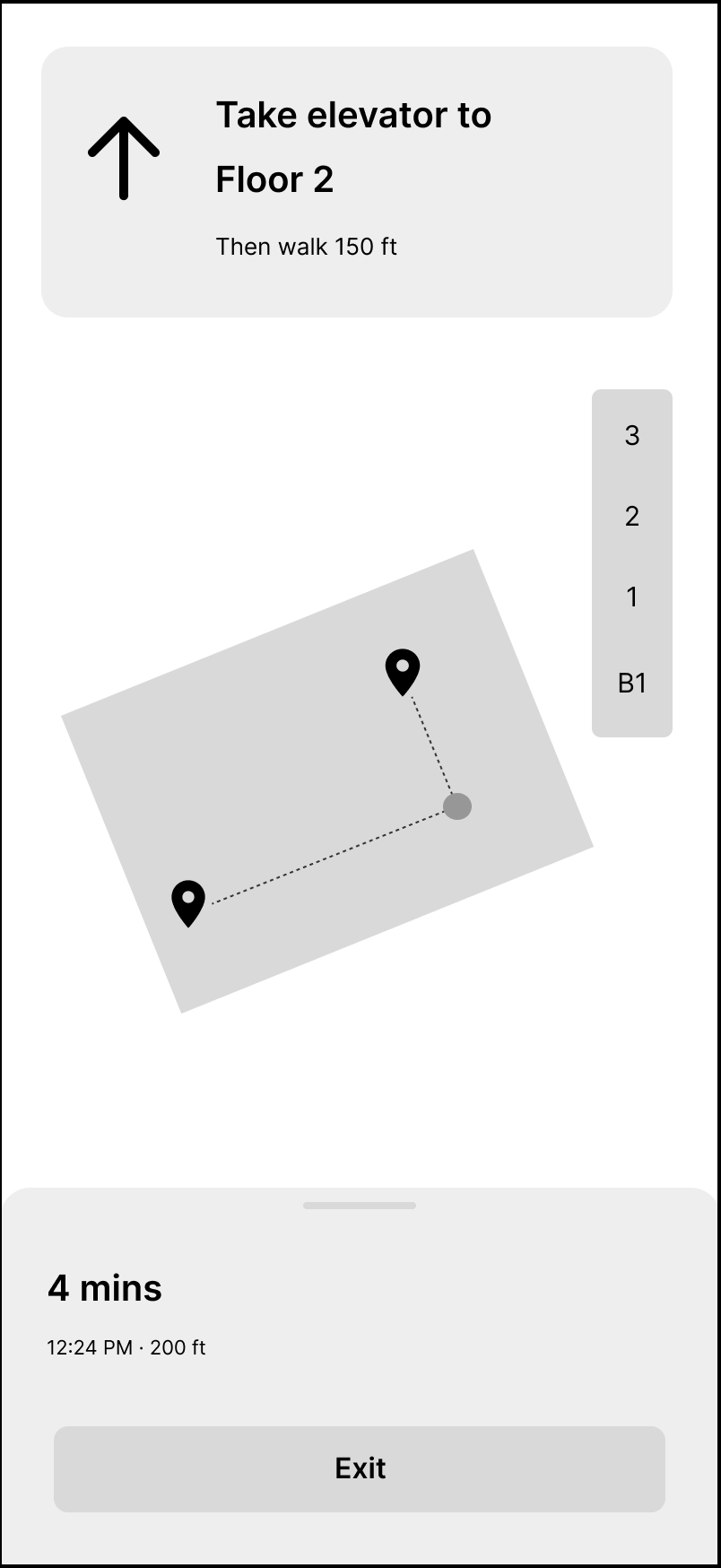
Navigating through the elevator transition
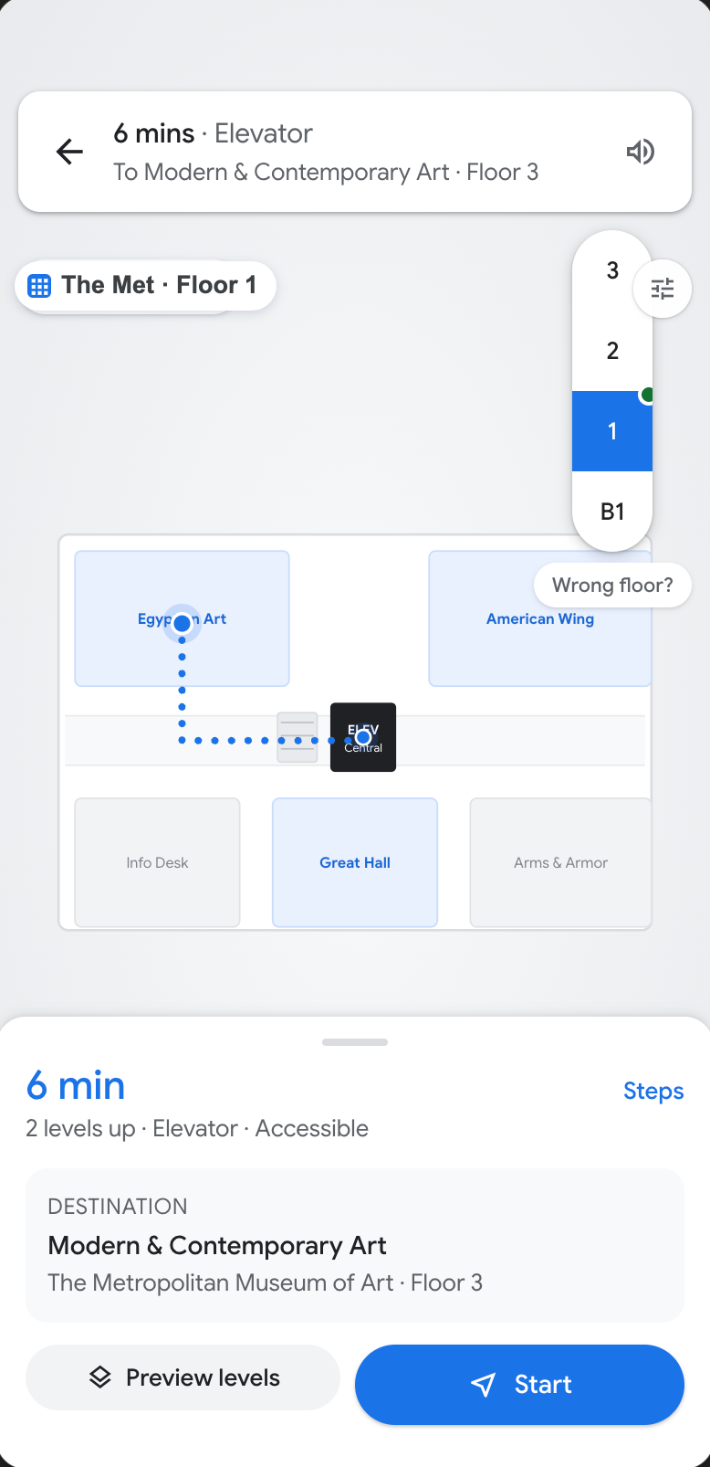
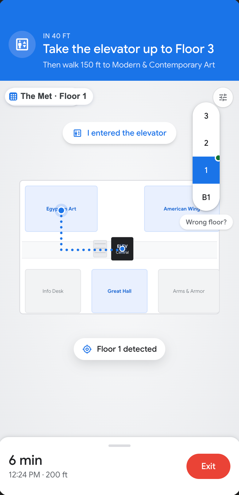
- ANavigation guides the user to the correct elevator.The turn-by-turn banner and map lead to the central elevator, not just "up."Proposed indoor behavior
- BThe system confirms the current level before the transition."Floor 1 detected" makes the assumption visible instead of silent.System feedback
- C"Wrong floor?" stays available when detection is off.If the level is wrong, correction is one tap away — no settings dive.System feedback
Being honest about what the phone actually knows.
Indoor positioning isn't always certain. Rather than pretend the current floor is always right, the design matches how confident the system is — and asks when it isn't sure.
- Automatically selects the detected level
- Shows the user's position on the floor
- Continues navigation without interruption
- Requests lightweight confirmation
- Lets the user pick another nearby level
- Avoids silently assuming the wrong floor
- Avoids showing false precision
- Presents only relevant nearby levels
- Resumes navigation after confirmation
Testing the model in a more complex building.
A museum is forgiving. To pressure-test the idea, I ran the same interaction model through Grand Central Terminal — from the Main Concourse down to Track 34. This is supporting validation, not a second case study.
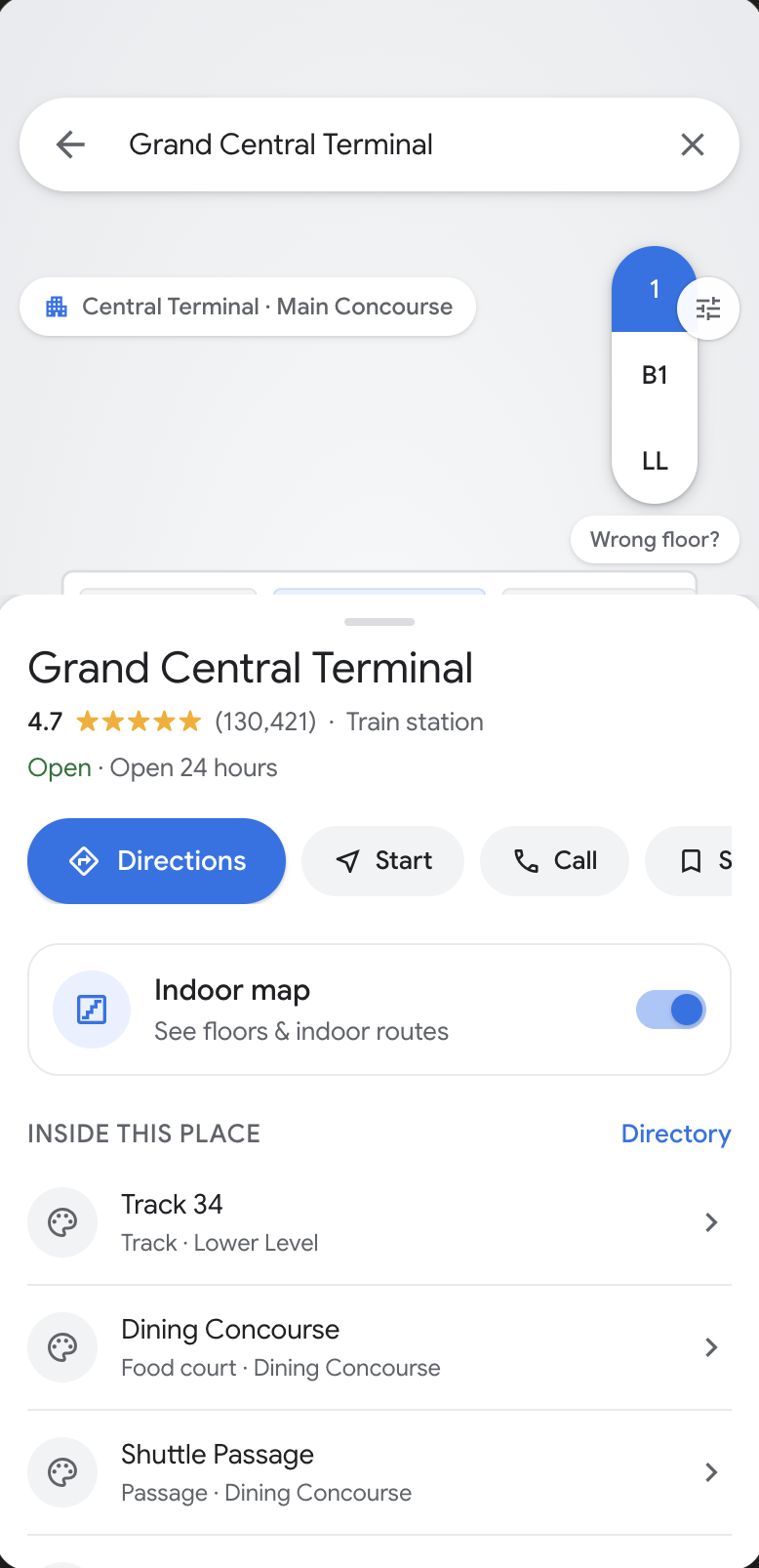
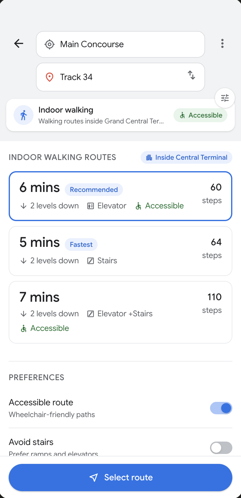
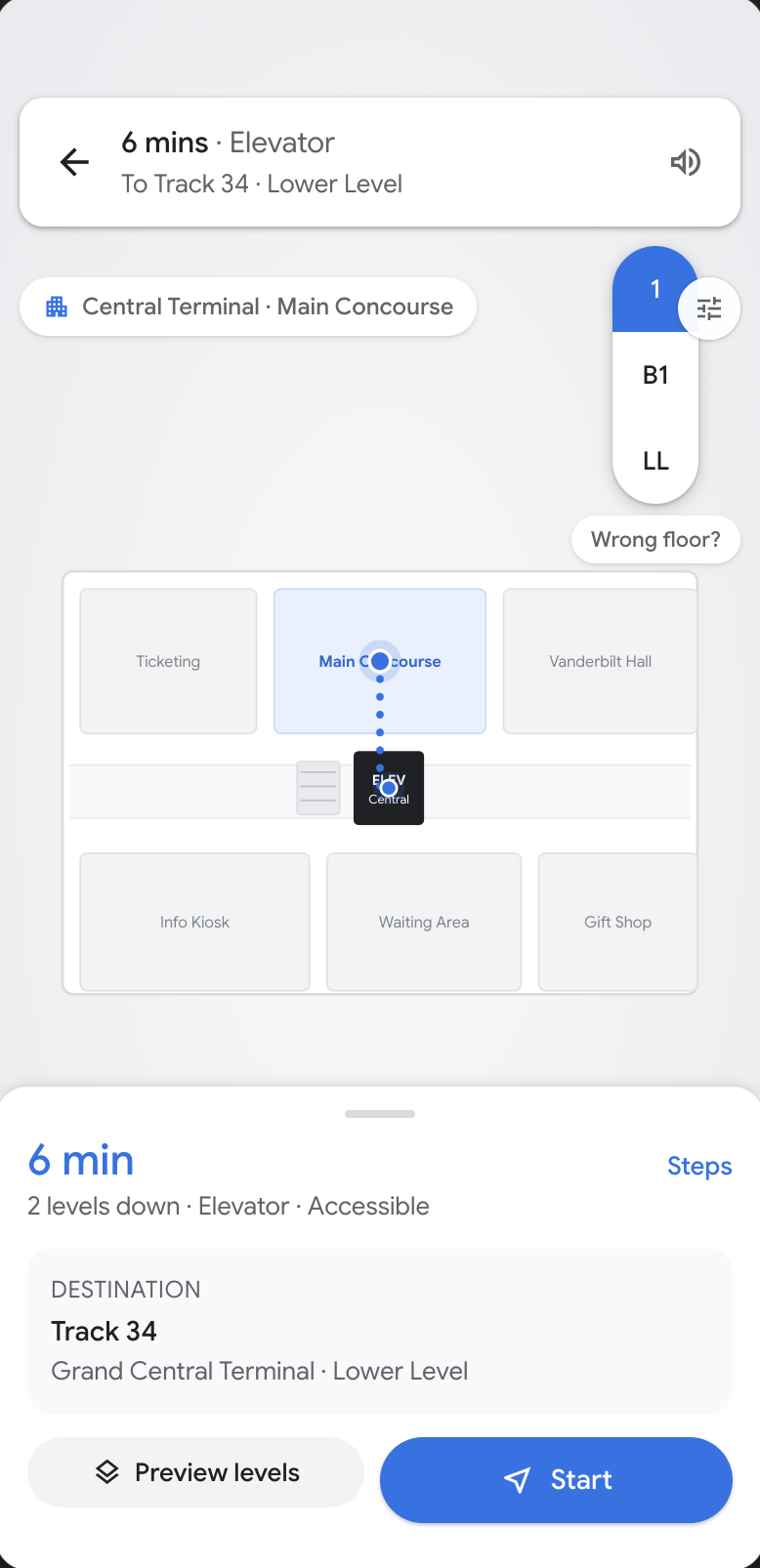
The same route cards, floor selector, and level preview carried over with almost no change — the model held up when the building got harder. Named levels replaced numbers, and "2 levels down · Elevator · Accessible" read just as clearly as it did at The Met.
The routes that don't go smoothly.
Designing inside someone else's product.
Working within constraints made the design sharper. When I stopped treating this as a new app and started treating it as a Google Maps feature, a lot of decisions got easier. I didn't have to invent a search pattern or a navigation model — I had to figure out where indoor information fit into ones that already work.
Showing the space beat describing it. My first instinct was to write clearer instructions. The version that actually helped was the multi-level preview — one picture of how the floors connect did more than a paragraph of directions, so I let everything else get quieter around it.
Accessibility belongs in the decision, not the settings. The most important move was putting stairs-vs-elevator on the route card. It costs almost no space, and it changes who the feature works for.
The model held up when the building got harder. Running the same flow through Grand Central — named levels, tracks, a downward route — barely changed the screens. That was the clearest sign the idea belonged inside Google Maps rather than beside it.