Case study · Product Design & AI

Optivoy

An AI travel-planning copilot that helps people create, understand, adjust, and manage a trip — all in one place.

Most AI planners stop at generating an itinerary. The harder, more interesting problem is what comes after: helping someone understand the plan, weigh its trade-offs, and change it without starting over. That framed the central design question:

How might an AI travel planner recommend a trip without taking control away from the traveler?
Role Product Designer
Project type Independent AI product concept
Platform Mobile web app
Focus Product strategy · UX flow · interaction design · AI explainability
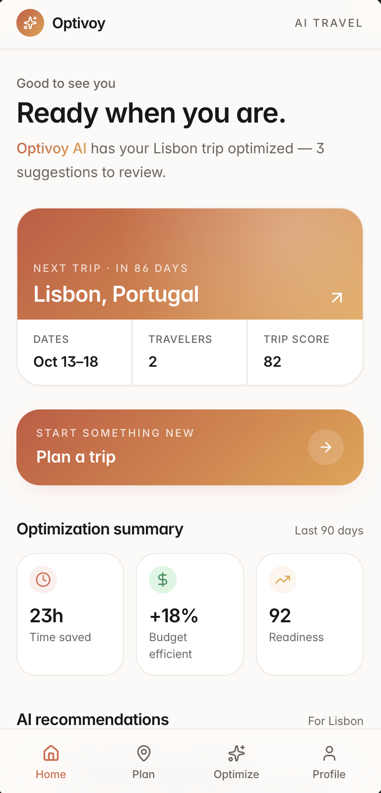
Optivoy home: greeting Ready when you are, a Lisbon next-trip card with dates, travelers and trip score, a Plan a trip action, and an optimization summary showing 23h saved, +18% budget efficiency, 92 readiness
The finished product

Home opens with the state of your travel life, not a search box: your next trip and how ready it is, one action to start something new, and a running tally of what the AI has already saved you. Its work always shows up as suggestions you can review — never silent changes.

Trip score 82 23h saved 3 suggestions to review
01 — The problem

Planning a trip means holding too many things together.

I started by looking at how people actually plan a trip today — and where the effort really goes. Four problems kept showing up.

1Everything lives in a different placeMaps, notes, booking sites, spreadsheets, and group chats each hold a piece of the trip. You're the only thing connecting them — and the first thing to break under pressure.
2AI plans don't explain themselvesA generated itinerary can look complete and still give you no reason to trust it. If you can't see why a choice was made, "AI-generated" just means "double-check everything."
3The trade-offs stay hiddenBudget, pace, travel time, and interests constantly pull against each other. People need to see what a choice costs — cheaper, but slower; fuller, but more tiring — before they accept it.
4A trip keeps changingDates move, budgets tighten, moods shift. A plan isn't done when it's generated — it has to stay editable right up to (and during) the trip.
02 — The person I designed around

Designing around one realistic trip.

To keep the work grounded, I designed against a single, concrete trip instead of an abstract audience. This is a scenario I used to guide the concept — not researched user data.

Scenario · used to guide the concept
A
AlexPlanning a 5-day Lisbon trip with a partner

Alex has a real budget, a few free evenings to plan, and a partner with slightly different interests. They want recommendations they can look over and adjust — not a plan they're expected to accept on faith.

Trying to doBuild a trip that feels personal to both of them, without spending a week researching it.
What's hardBalancing budget, pace, and two sets of interests across five days — and knowing whether the numbers are realistic.
What Alex needsA starting plan they can review, understand, and edit — one place that keeps the whole trip together.
Makes AI trustworthyEvery suggestion explains its reason and cost, applies only when Alex says so, and can be undone.
03 — The early product question

The first question wasn't what the UI should look like — it was what the product should actually do.

The first version could have stopped at "enter your details and generate an itinerary." But that just makes another one-time AI generator. I wanted the product to keep working after the plan appears, so I mapped a broader flow before touching any screens.

01Intent
02Trip details
03Preferences
04Review
05AI plan
06Ongoing trip management

The last two steps are where most tools stop — and where Optivoy's real value lives.

04 — Low-fidelity exploration

Before polishing the UI, I mapped the core flow.

I sketched the whole path in low fidelity first — from opening the app to managing the trip after it's built — to make sure the structure held before any visual design.
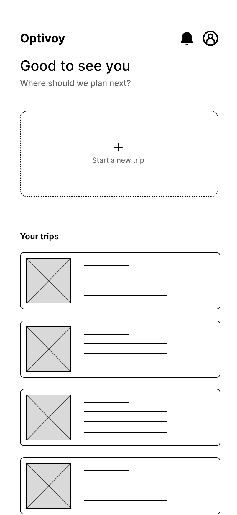

Low-fidelity wireframe: home screen with a Start a new trip card and a list of existing trips01
Starting from an existing trip or creating a new one.
Low-fidelity wireframe: trip setup with destination, dates, travelers and origin fields02
Collecting only the essential trip details first.
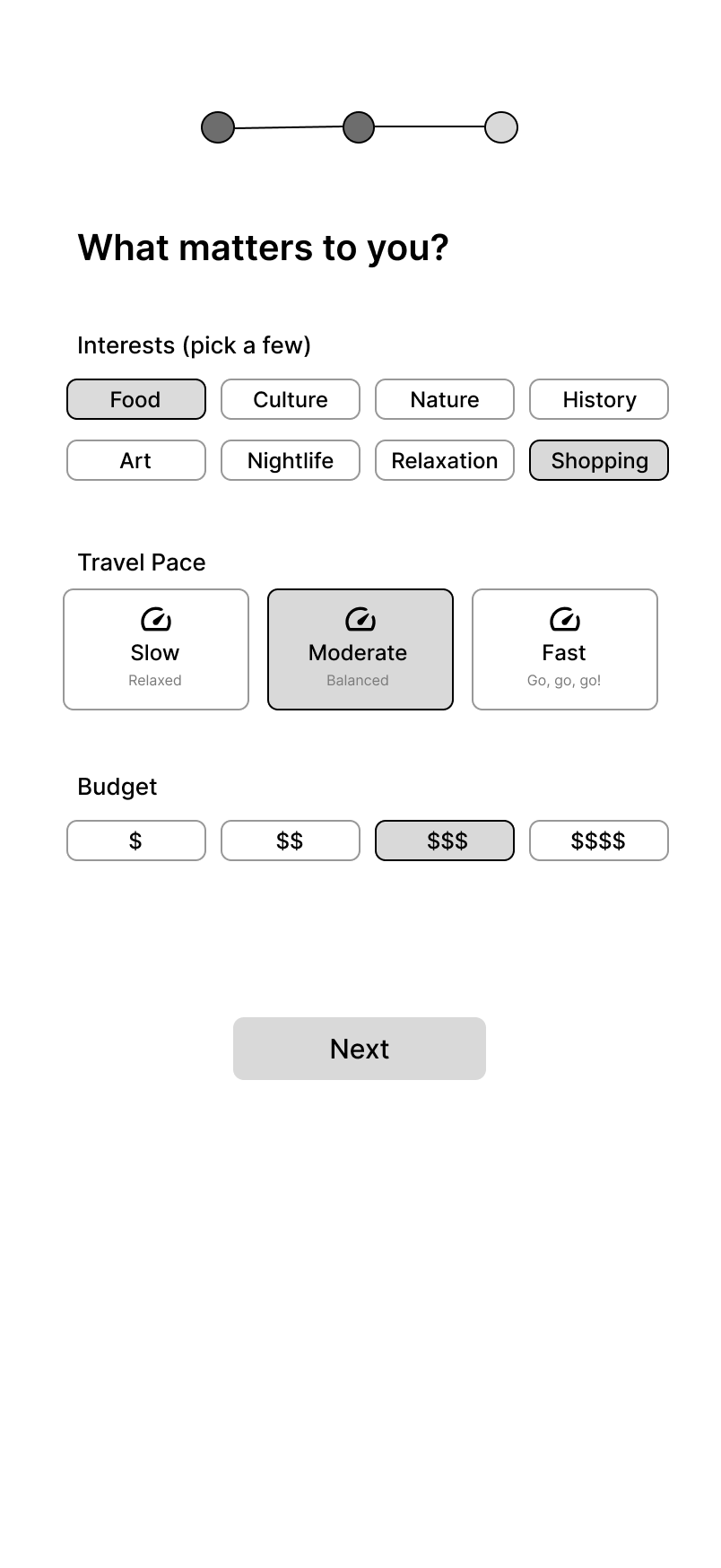
Low-fidelity wireframe: interests, travel pace and budget selection03
Turning preferences, pace, and budget into clear choices.
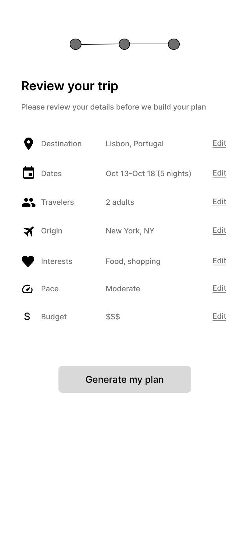
Low-fidelity wireframe: review screen listing every input with edit links before generation04
Letting the traveler confirm every input before generation.
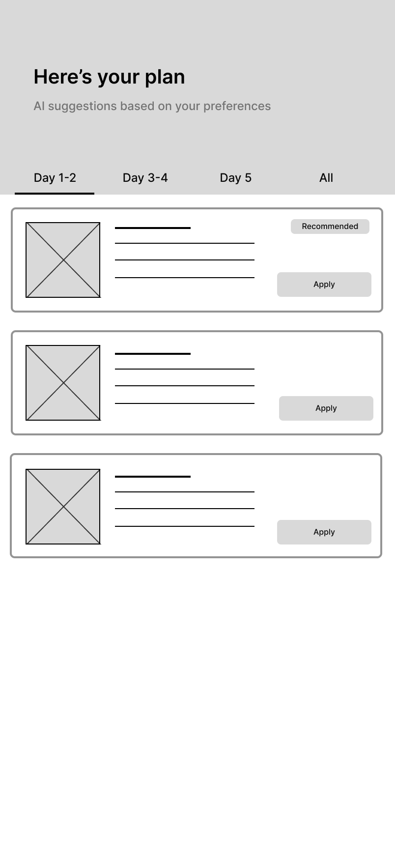
Low-fidelity wireframe: AI plan output with recommendations shown as reviewable cards with Apply actions05
Showing AI suggestions as options that can be reviewed.
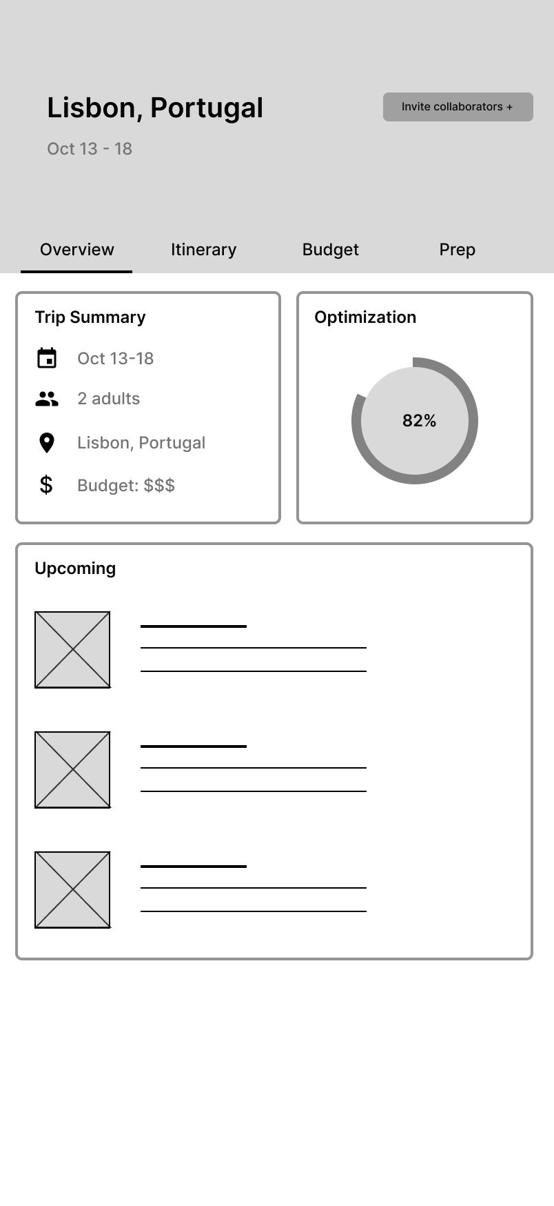
Low-fidelity wireframe: trip hub after generation with Overview, Itinerary, Budget and Prep tabs06
Keeping the trip editable after the initial plan is created.

The wireframes helped me see that the product couldn't end at generation. Creating the plan was only the midpoint.

05 — What changed after wireframing

From an itinerary generator to an ongoing trip copilot.

Three shifts happened between the low-fidelity flow and the final design. Each one moved the product further from "generate and done."

A
From one long form to a short guided setup

Instead of one big form, the user answers one kind of question at a time: trip basics, then preferences, then budget, then review.

Low-fidelity trip setup wireframe
Low-fidelity setup
Final Basics setup screen
Final · Step 1 of 4
B
From a black-box result to explained suggestions

Each recommendation now shows its reason, its benefit, its trade-off, and a clear Apply action — instead of a plan you either take or regenerate.

Low-fidelity AI plan wireframe
Low-fidelity plan output
Final AI recommendations screen
Final · explained suggestions
C
From a generated document to an editable trip hub

The itinerary, budget, preparation, and preferences stay connected after generation — one trip you keep editing, not a document you export.

Low-fidelity trip hub wireframe
Low-fidelity trip hub
Final trip overview screen
Final · connected trip hub
06 — Designing the setup flow

Four short steps, in the order people can answer them.

Facts first, then taste, then money, then a review before the AI builds anything. Each step is one screen with one job.
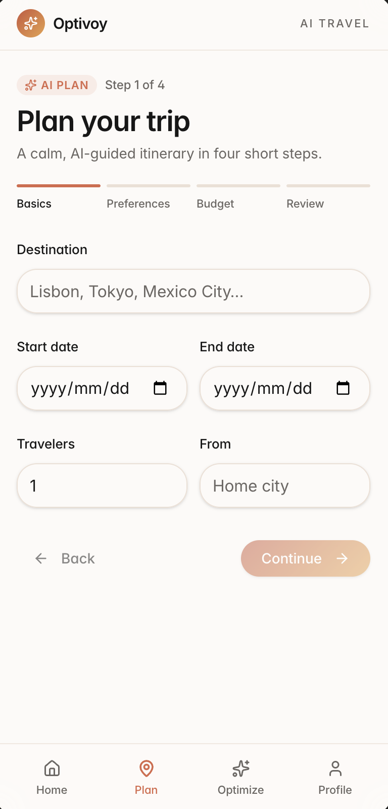
Plan step 1 of 4, Basics: destination, dates, travelers, and origin city
1 · Basics. Destination, dates, travelers, origin — the four facts everything else depends on.
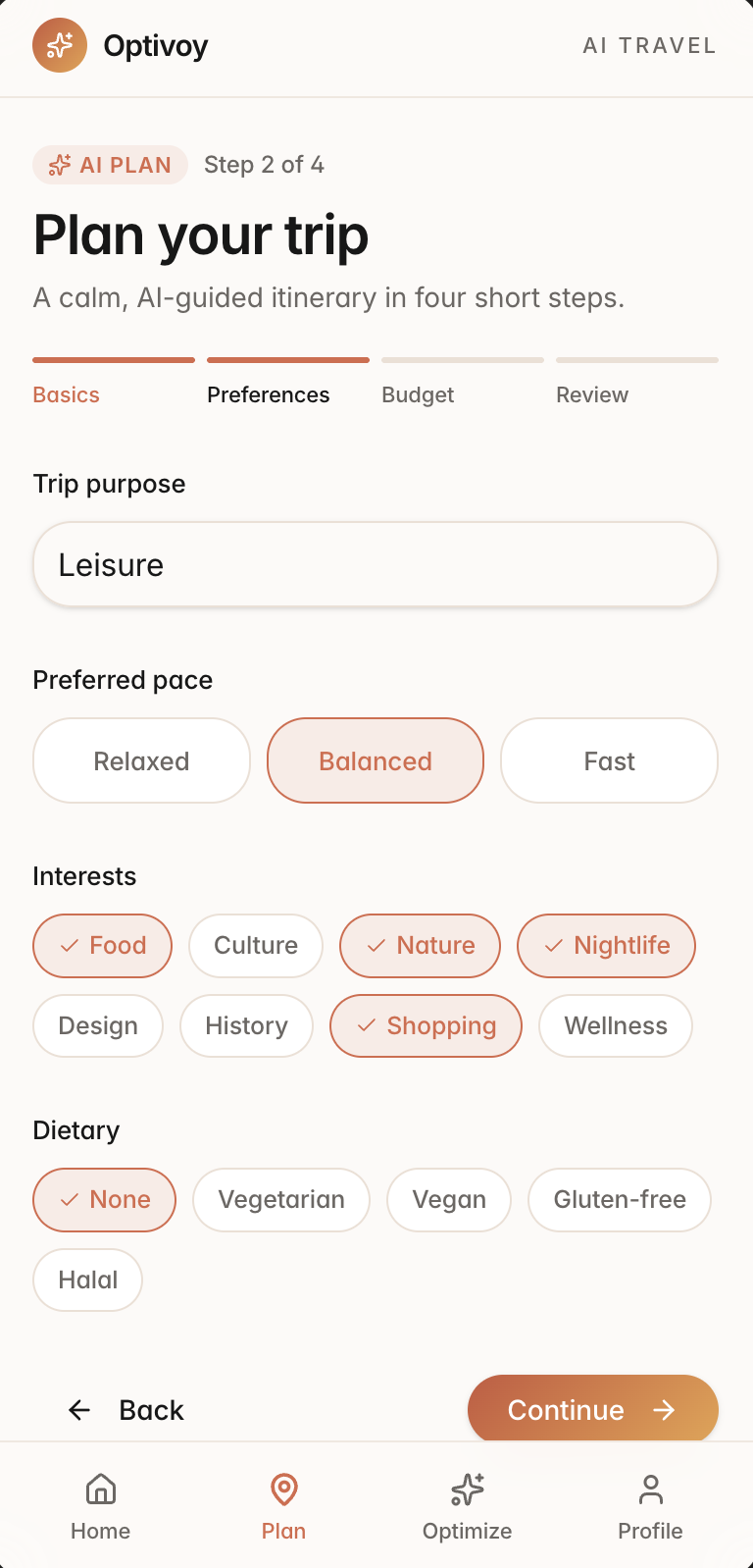
Plan step 2 of 4, Preferences: pace, purpose, interests and dietary chips with selected states
2 · Preferences. Pace, purpose, and interests as chips — the selected ones stay clearly marked.
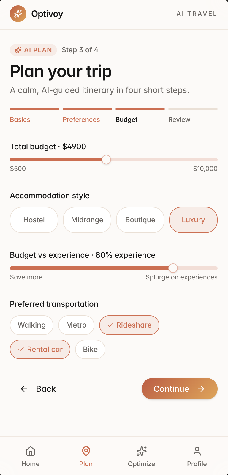
Plan step 3 of 4, Budget: total budget slider, accommodation style, and a save-versus-splurge slider
3 · Budget. The envelope and what the money is for — the save-vs-splurge choice that later powers optimization.
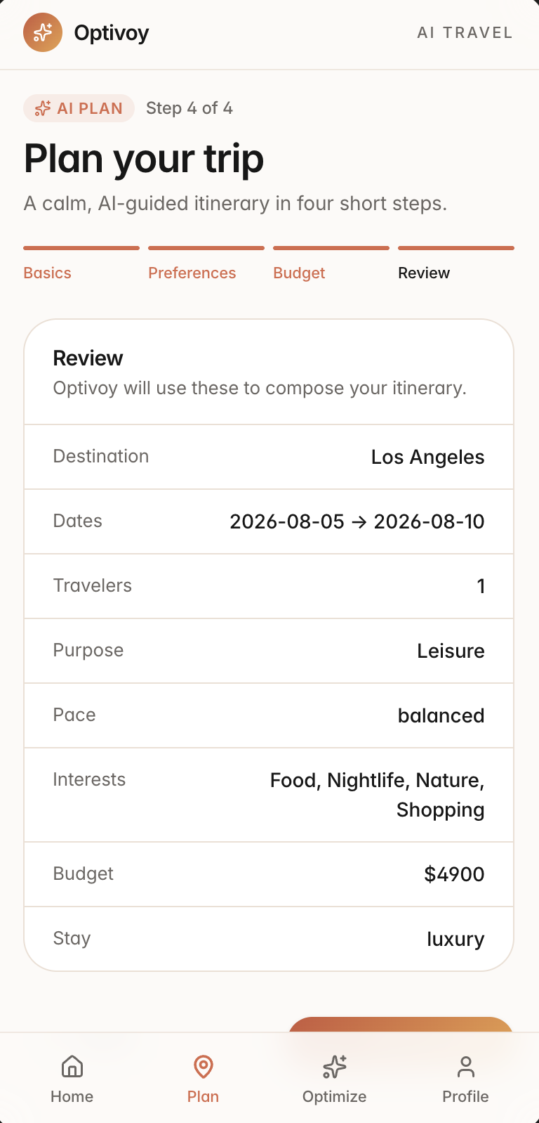
Plan step 4 of 4, Review: a table restating every input before generation
4 · Review. Every input restated before generation — the AI's brief, shown to the person it's about.
AOne kind of decision per screen. Facts, taste, money, confirmation — nothing asks the user to hold two kinds of choice at once.
BChosen options stay visible. Selected chips keep a check and a fill, so people always know what they've already answered.
CReview creates a clear pause. Showing every input before generation sets up the product's core promise: you can always see why the plan looks the way it does.
07 — Explaining AI recommendations

A recommendation should explain itself before asking for trust.

I wanted the AI to make its case, not just change the trip. Every suggestion carries five parts, and applying one is always a deliberate, reversible choice — the AI proposes, the traveler decides.
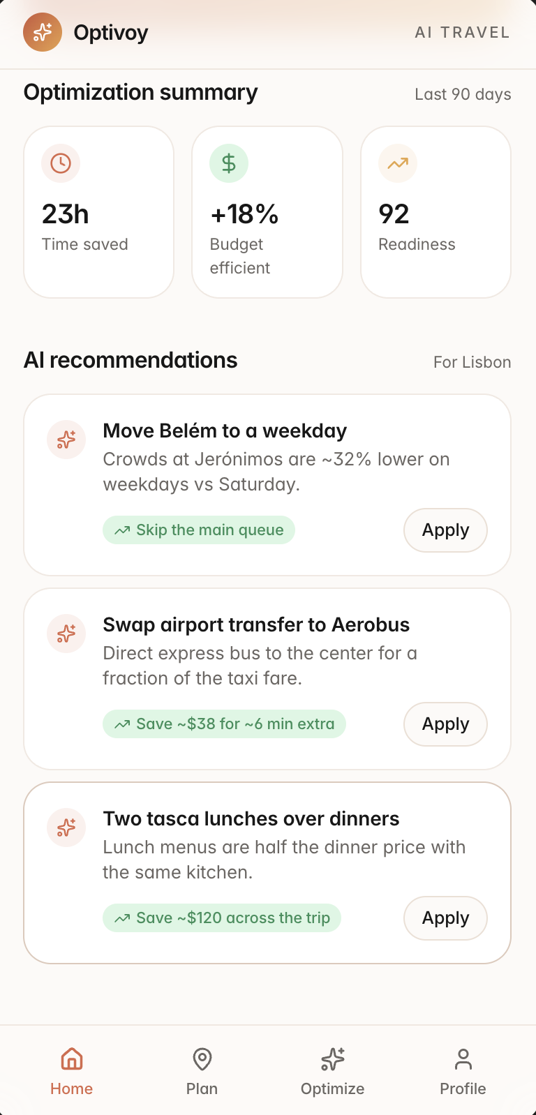
AI recommendations for Lisbon: move Belém to a weekday because crowds are ~32% lower, swap airport transfer to Aerobus saving ~$38 for ~6 min extra, and two tasca lunches over dinners saving ~$120 — each with an Apply button
What every suggestion shows
1The recommendation — a concrete change: "Move Belém to a weekday."
2Why it was suggested — the reason in plain words: "crowds are ~32% lower on weekdays."
3The expected benefit — in green, only ever for time or money won: "Save ~$120."
4The trade-off — the cost sits next to the benefit: "Save ~$38 for ~6 min extra."
5The Apply action — a quiet, secondary button; the AI never applies itself.

Apply is deliberate and reversible. The AI proposes; the traveler decides, one suggestion at a time, and can undo any change afterward. The goal isn't for people to accept everything — it's for them to accept the suggestions that are actually right for their trip.

08 — Giving users control

Adjusting the plan should feel like editing — not starting over.

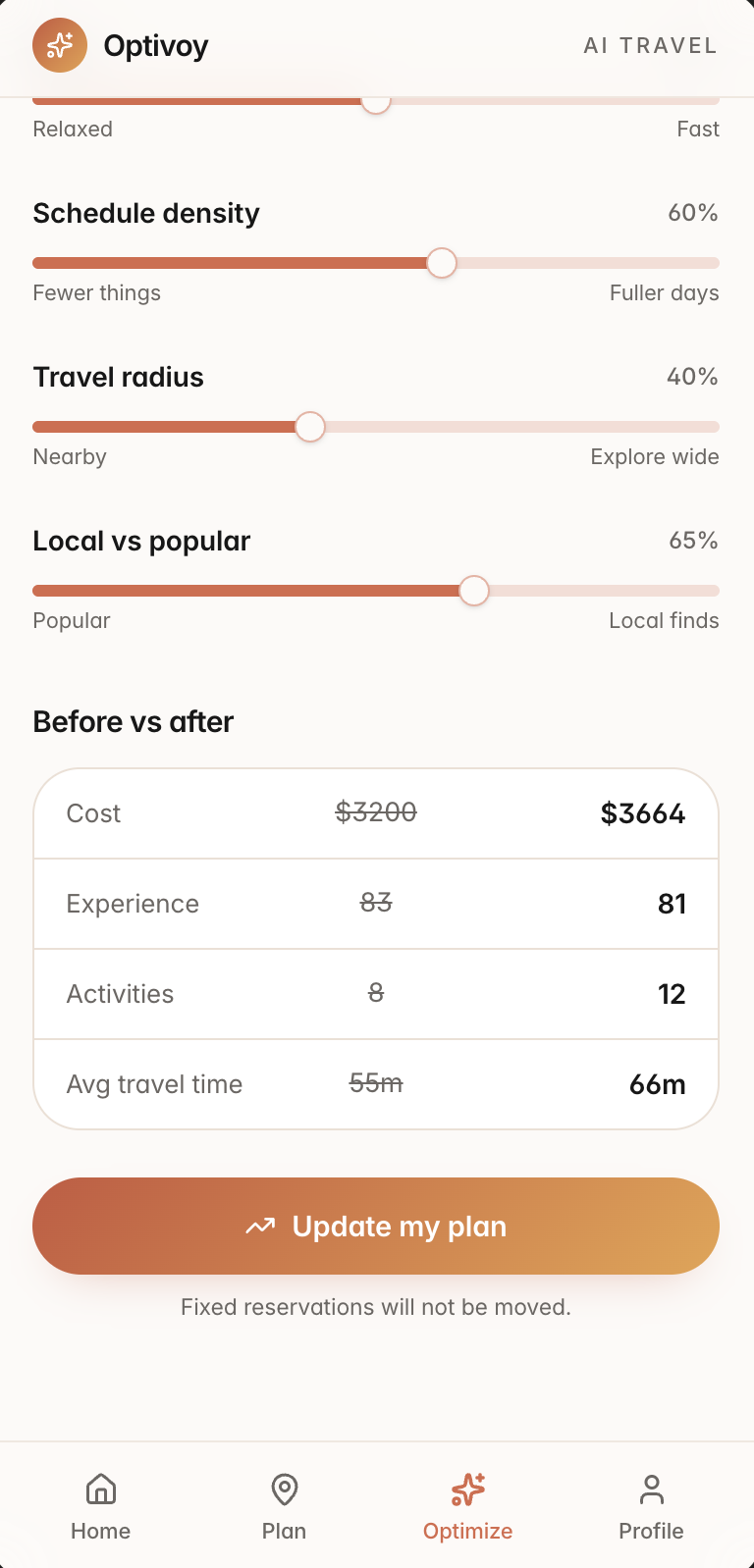
Rather than a "regenerate" button, the user adjusts named priorities — budget, pace, schedule density, travel radius, local vs popular — and sees the effect before committing to it.
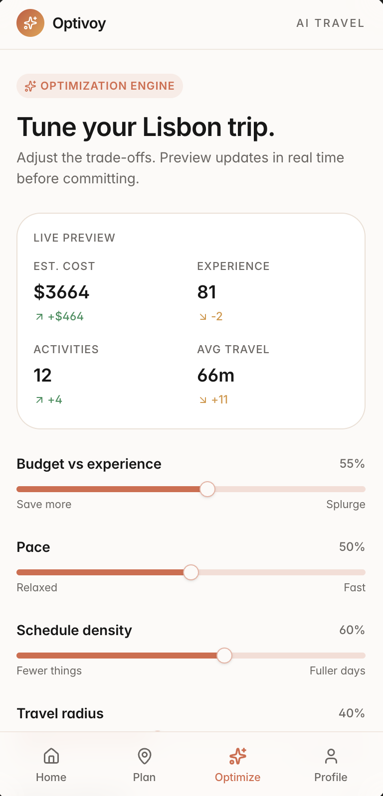
Tune your Lisbon trip with a live preview showing estimated cost, experience, activities and average travel time, above sliders for budget vs experience, pace, and schedule density
Live preview. Cost, experience, activity count, and travel time update as the sliders move — each change signed and colored by whether it helps or costs.
Travel radius and local vs popular sliders, a before versus after comparison, an Update my plan button, and the note Fixed reservations will not be moved
Before vs after. The old numbers sit beside the new ones, then one explicit commit — and fixed reservations stay put.
1Controls are named in outcomes. "Save more ↔ Splurge," "Nearby ↔ Explore wide" — adjusting the plan never requires understanding the model behind it.
2Preview first, commit second. The preview is free to explore; nothing touches the real itinerary until "Update my plan." Trying things out is safe.
3It shows what gets worse too. A change that costs more or lowers experience is flagged, not hidden — a tool that only reports wins teaches people to ignore it.
09 — After generation

The trip stays useful after the AI finishes.

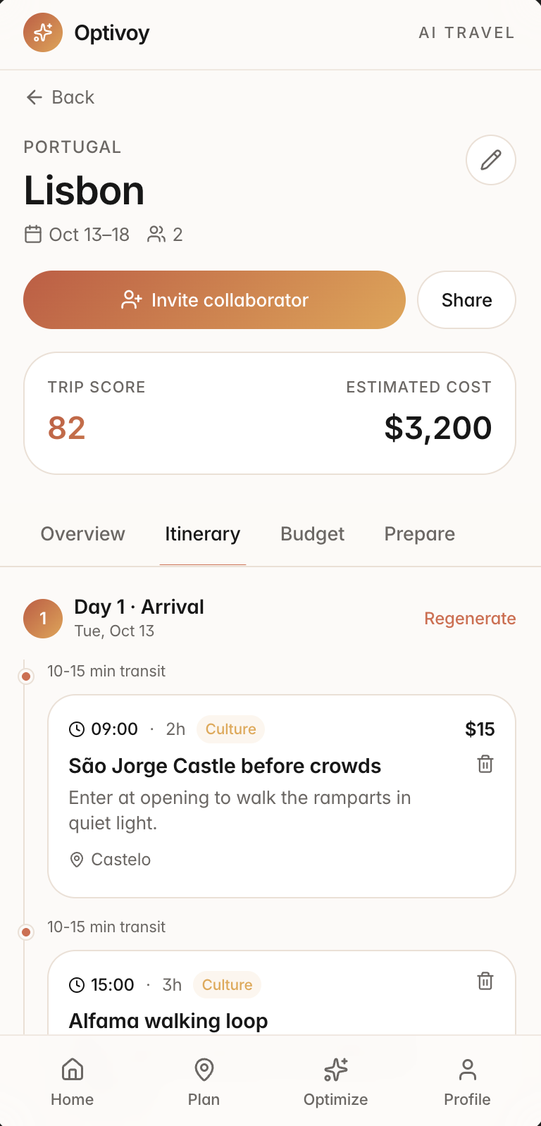
One trip carries four tabs under a persistent header — so planning and managing never feel like separate apps.
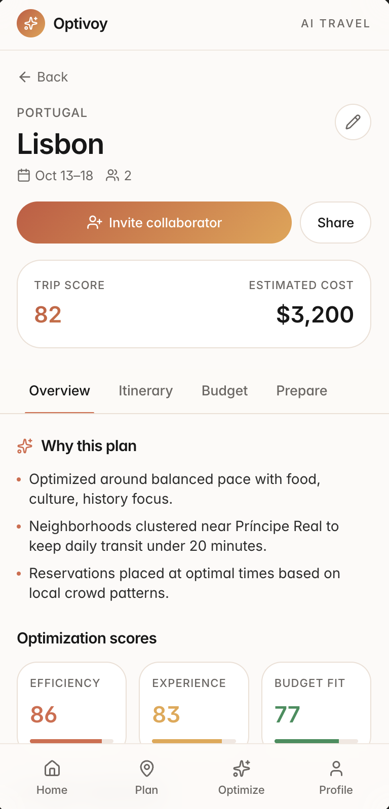
Trip overview for Lisbon: trip score 82, estimated cost, a Why this plan section, and optimization scores
Overview. Summarizes the trip and explains why the plan fits.
Itinerary tab: day-by-day timeline with activities, transit timing, and per-day regenerate
Itinerary. Organizes the trip day by day, with travel time shown between stops.
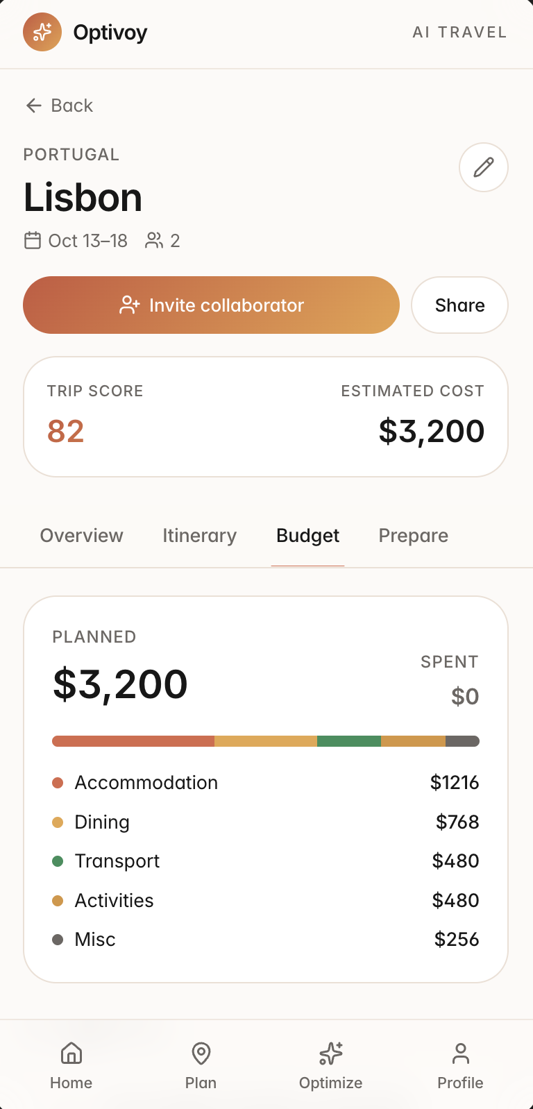
Budget tab: planned versus spent, with a category bar and itemized breakdown
Budget. Keeps planned and actual spending connected.
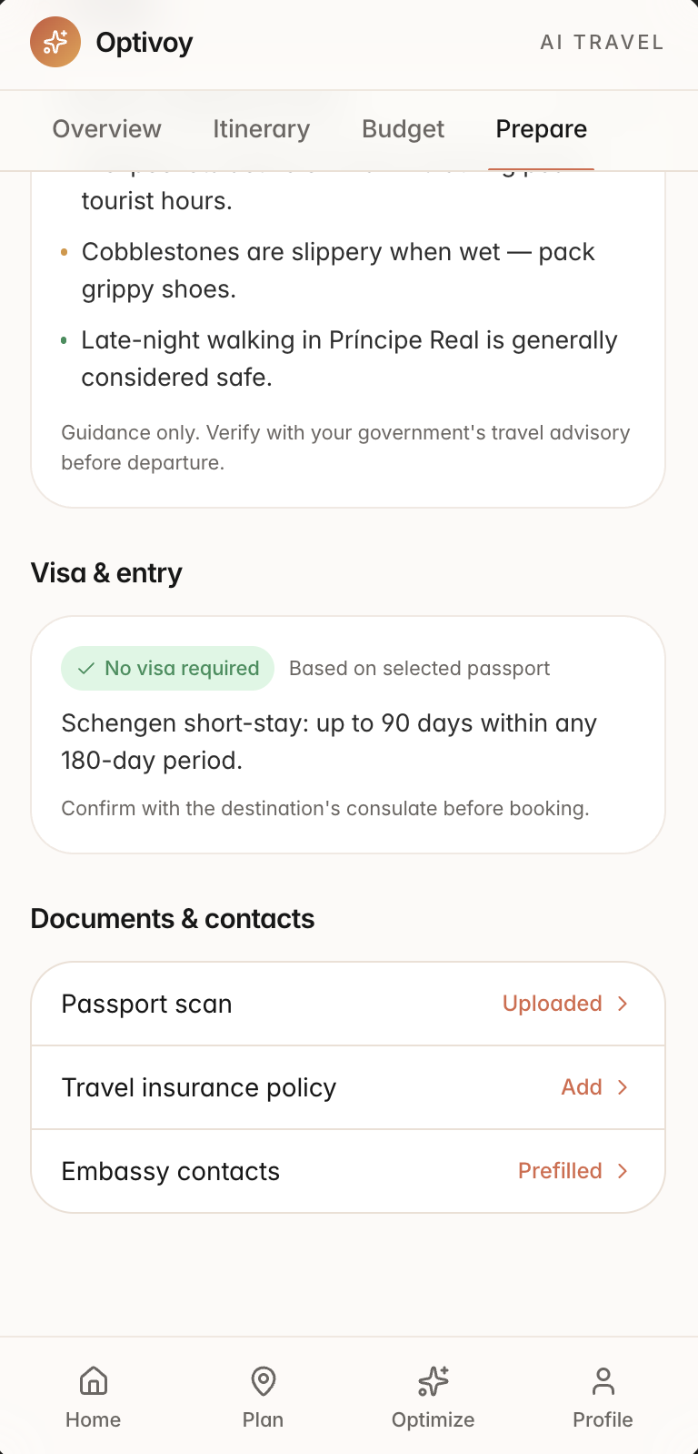
Prepare tab: safety notes, visa and entry status from the stored passport, and documents and contacts
Prepare. Keeps travel requirements, packing, and documents close to the trip.
10 — Edge cases

What happens when the recommendation or plan is wrong?

An AI product only earns trust if it handles the moments it gets things wrong. These are the states I designed for.

Preferences conflictProblemRelaxed pace, eight interests, and five days can't all win.ResponseName the conflict and show which preference was prioritized.
Budget can't support the styleProblemA low budget with Luxury selected would disappoint at generation.ResponseCatch it at the budget step: raise the budget, or see the closest achievable plan.
A recommendation is low-confidenceProblemA confident tone on weak evidence loses trust fastest.ResponseShow a "limited data" state — or hold the suggestion back entirely.
A place closes after planningProblemThe plan silently goes stale after it's generated.ResponseFlag the change with a suggested replacement, applied only by choice.
Conflict with a fixed reservationProblemThe sliders want a change that would move a locked booking.ResponseProtect the booking and say what the plan couldn't do, and why.
Undo an applied changeProblemIf Apply feels irreversible, people won't use it.ResponseMake it reversible from the itinerary it changed, with the original state named.
11 — What I would test

What I would test before treating the idea as successful.

This is a concept built on product analysis and assumptions, not completed research — so here's the plan, not the outcome. I'd sit with travelers planning a real personal trip and watch for five things.

01Can people complete the setup without help?
02Can they explain, in their own words, why the AI made a recommendation?
03Do the benefits and trade-offs actually affect their decisions?
04Do they understand what will change before pressing Apply?
05Can they recover after making or accepting the wrong choice?
12 — Reflection

What designing Optivoy taught me.

AI works better as decision support than as an authority. The AI proposes, explains, and admits trade-offs; the person decides. Every screen follows from that.

Personalization and control belong together. A plan feels personal when your priorities visibly shaped it — and you can re-shape it whenever you want.

Optimization has to be visible. Live previews, signed changes, and before-vs-after comparisons turn invisible work into something people can trust.

The experience can't end at generation. Preparation and everyday trip management are the core of the product, not an afterthought.

← Back to all work