Team project · Product Design · Fitness & Nutrition

Chiron

A fitness companion that turns personal goals into a realistic daily plan.

Chiron brings workouts, meal guidance, scheduling, and progress into one connected experience. Our team designed it for people who want more direction than a content library, but need something more flexible than a personal coach.
Role Lead UI Designer
Team Four-person team
Project type Team project
Tools Figma · Miro
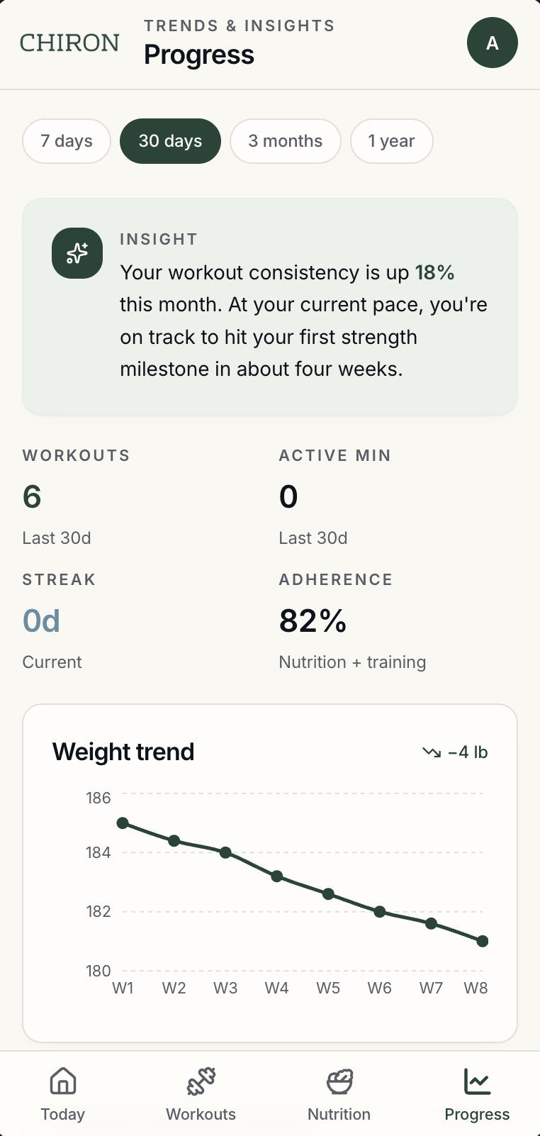
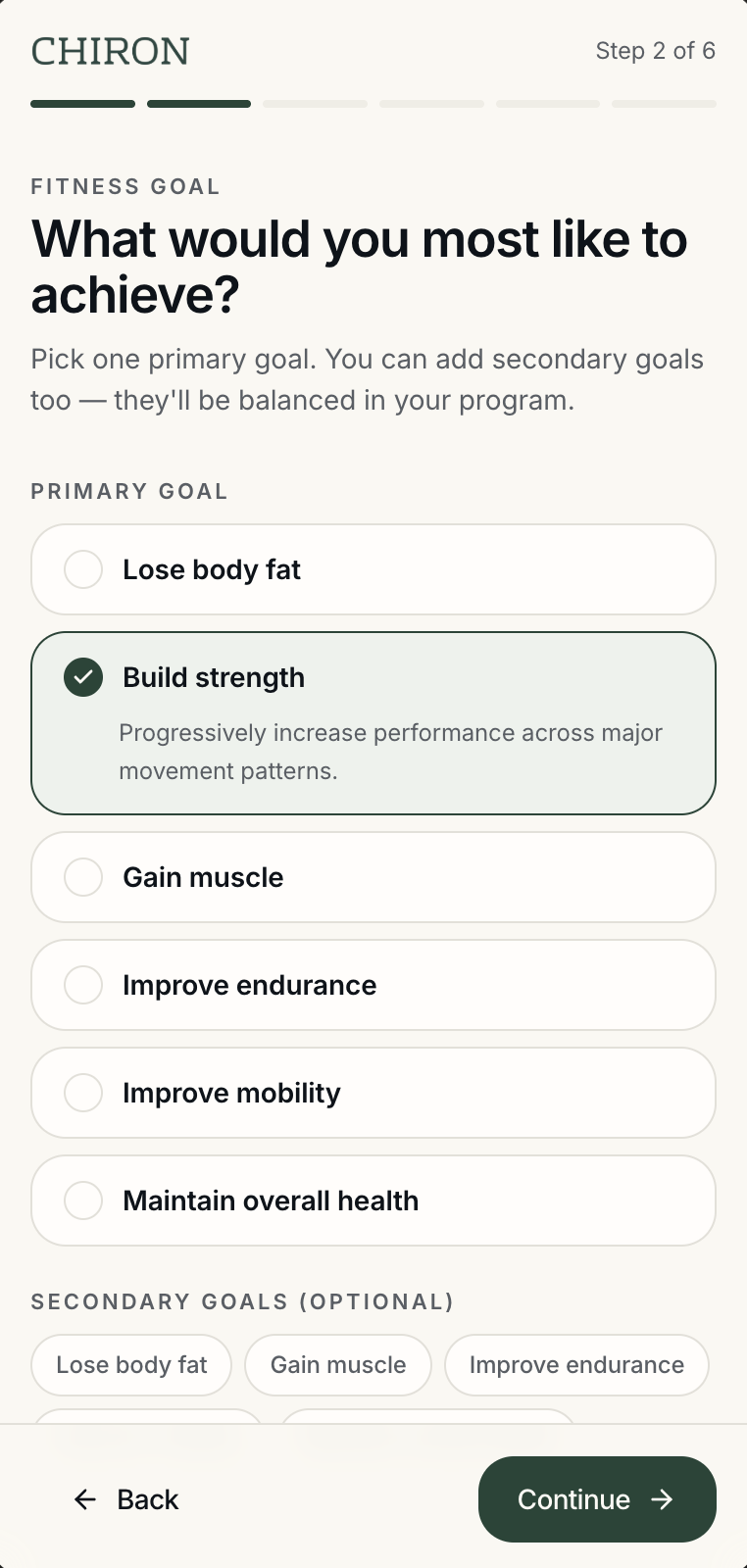
Chiron onboarding: goal selection with Build strength chosen as the primary goal Chiron Today dashboard: a personalized daily focus, one recommended workout with an exercise preview, and a start action Chiron Progress: a plain-language insight card above workout and adherence stats and a weight-trend chart
My contribution

As Lead UI Designer, I focused on translating the team's research and early ideas into a consistent interface across onboarding, workouts, nutrition, scheduling, and progress.

01 — The opportunity

The problem wasn't a lack of fitness content.

Fitness apps already offer large libraries of workouts, food trackers, schedules, and progress charts. People still have to decide which workout fits their goals, how to make time for it, what to eat alongside it, and whether their routine is working.

1Finding time is difficultPeople struggle to fit exercise and healthy meals into a busy schedule.
2Workouts and diet feel disconnectedPeople may track one without knowing how it should affect the other.
3Too many choices create uncertaintyA large workout library does not necessarily tell someone what they should do today.
4Progress doesn't always give directionNumbers can show what happened without explaining what should happen next.
02 — What we learned

What six interviews and our survey helped us understand.

We started by talking to people about how fitness fit into their daily lives. Our team ran six user interviews and sent out a survey to learn how people plan their diet and workout routines.

56%of users did not track their diet
66.7%of users preferred working out at the gym
62%of users did not currently have a diet plan
What people told us
Most preferred working out at a gym when they had enough time. People used exercise as a way to relieve stress. Many did not have a consistent diet plan. People found it hard to make time for both exercise and healthy food.
What it changed

The research showed us that motivation was not the only issue. People also needed help fitting exercise and food choices into the rest of their lives.

03 — The person we designed around

Giving the problem a real person and routine.

AW
Anthony Walker 30 · IT professional Manhattan, New York

"A healthy body and mind starts with great habits."

Anthony believes in maintaining a healthy lifestyle and physique. Exercise gives him a way to relieve stress from his busy work schedule. He tries to visit the gym at least three times a week and works out from home when the gym is not an option.

Bachelor's degree Male Energetic
Goals
Live a healthy lifeMaintain a good physiqueFollow an organized workout routineKeep track of his dietBuild body massLive a long life
Pain points
Often loses track of his dietHas an inconsistent workout routineOften eats fast foodLacks fitness knowledgeFinds it difficult to make time to work out

Anthony helped us focus on a user who wanted structure, but whose schedule made rigid plans difficult to maintain.

04 — The design challenge

How might workouts and nutrition work as one plan?

Our guiding question

How might we help busy people turn their goals, schedule, fitness level, and food preferences into a workout and nutrition routine they can realistically follow?

05 — Early low-fidelity wireframes

Our first version was much more basic.

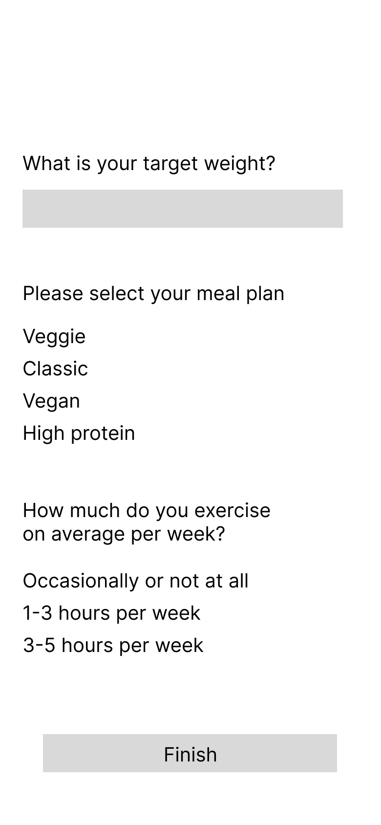
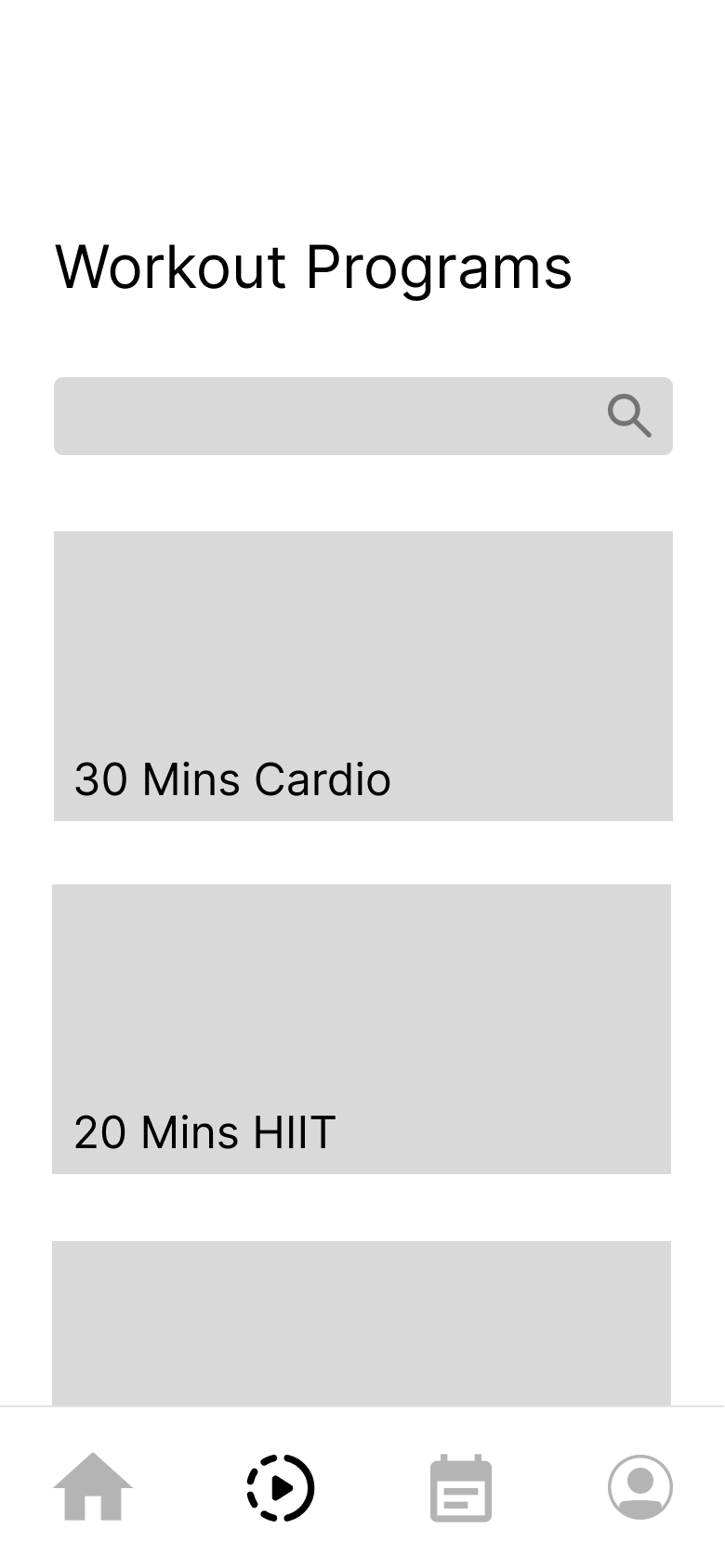
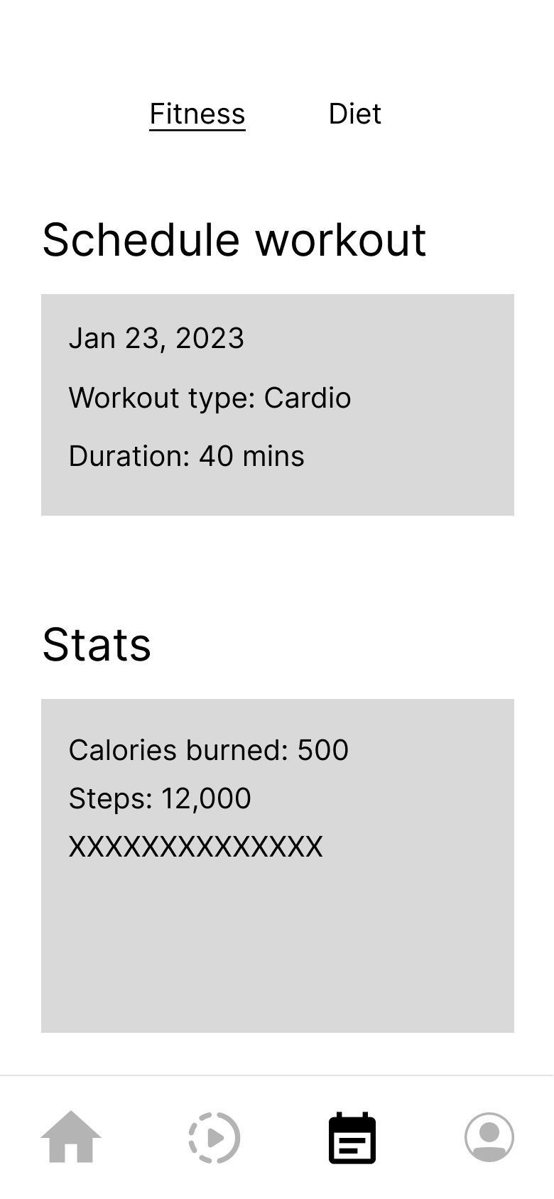
Before polishing anything, we sketched the main pieces in low fidelity — sign-up, a survey, a workout library, and separate scheduling and diet screens.
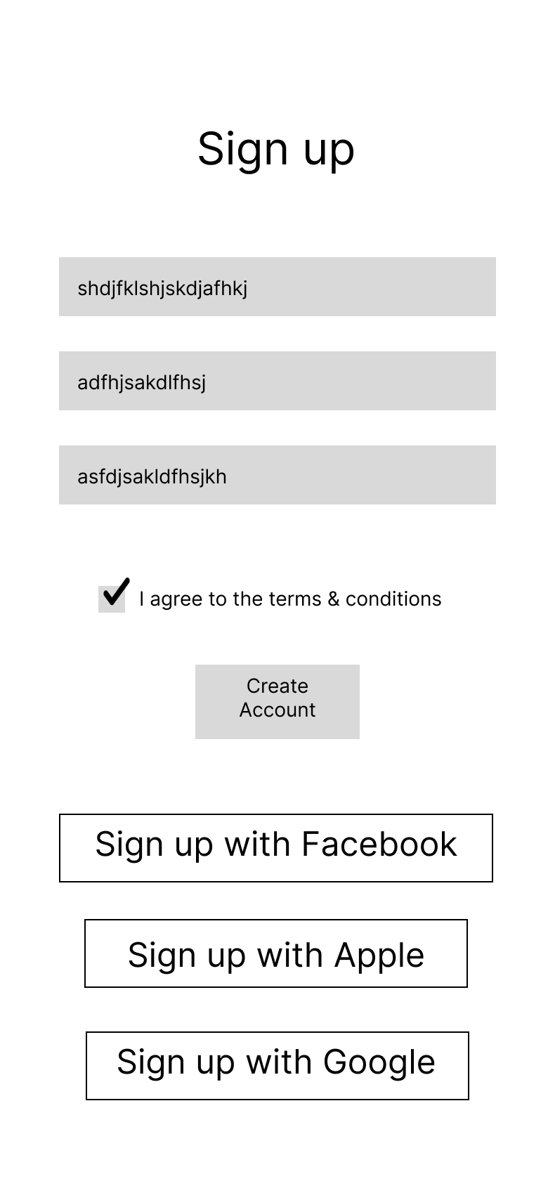
Low-fidelity wireframe: sign-up screen with account fields, a terms checkbox, and social sign-up options01
Creating an account before entering the product.
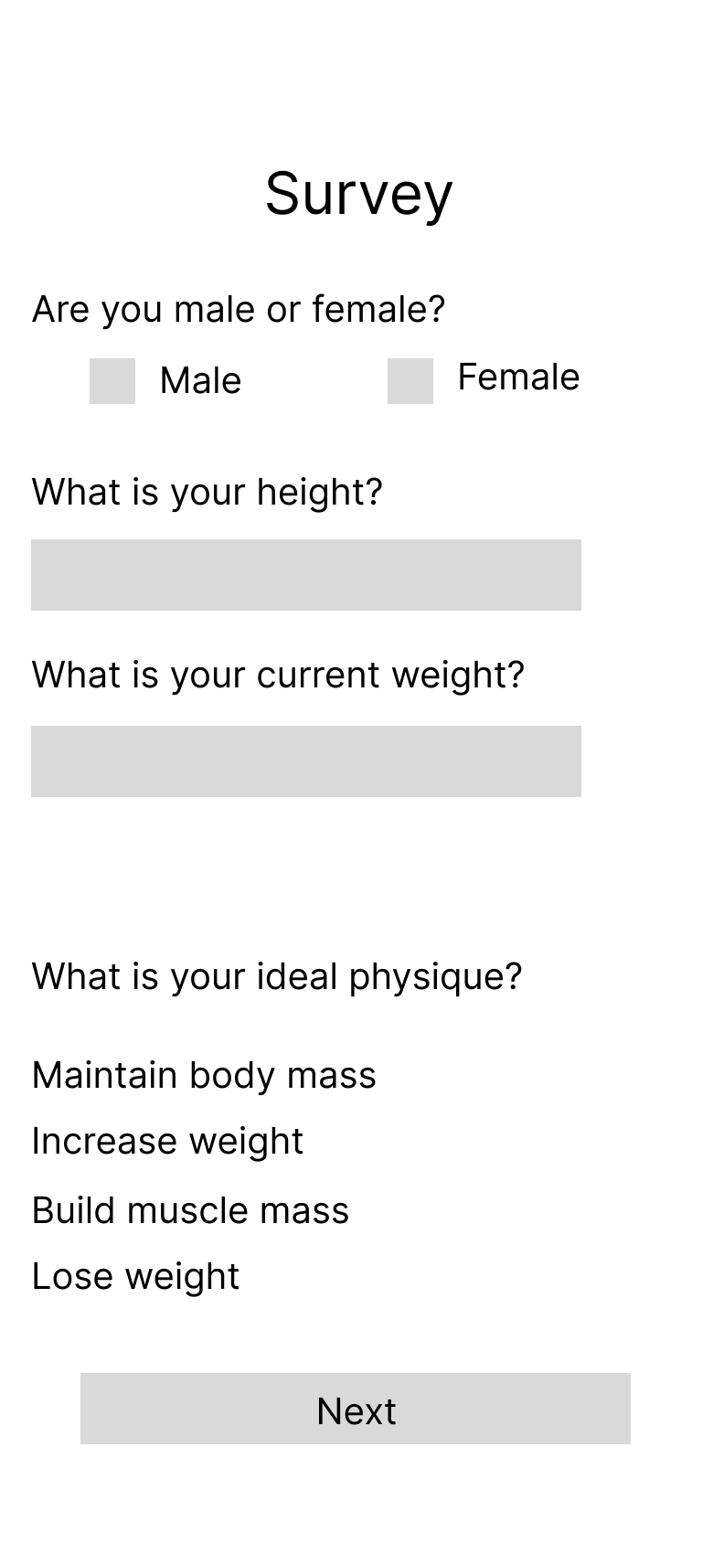
Low-fidelity wireframe: survey asking gender, height, current weight, and ideal physique02
Collecting basic body information and the user's fitness goal.
Low-fidelity wireframe: survey continued with target weight, meal plan, and weekly exercise frequency03
Adding target weight, meal preference, and exercise frequency.
Low-fidelity wireframe: workout programs library with a search field and program cards04
Browsing a general library of workout programs.
Low-fidelity wireframe: fitness tab with a scheduled workout card and a basic stats card05
Separating workout scheduling from basic activity statistics.
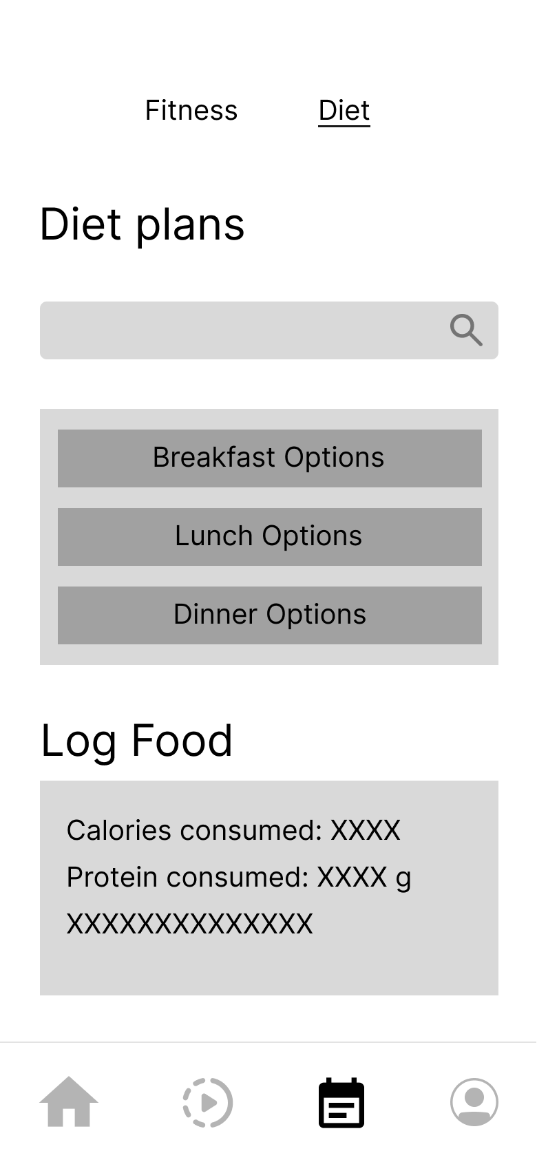
Low-fidelity wireframe: diet tab with meal-option buttons and a food log card06
Separating diet plans and food logging from the fitness experience.

The early wireframes gave us the main pieces, but they still behaved like separate tools. The survey collected information, workouts lived in a library, and diet had its own section. The next step was deciding how these pieces could work together.

06 — What changed

From separate features to one daily experience.

As we developed the idea, we began connecting the pieces into one plan. Four changes moved the product from a set of tools to a single daily experience.

A
From one broad survey to guided onboarding

The early survey placed many unrelated questions together. The final design separates goals, experience, schedule, equipment, and nutrition into shorter steps.

Low-fidelity survey wireframe
Low-fidelity survey
Final onboarding goal step
Final · guided step
B
From a generic workout library to a recommended daily workout

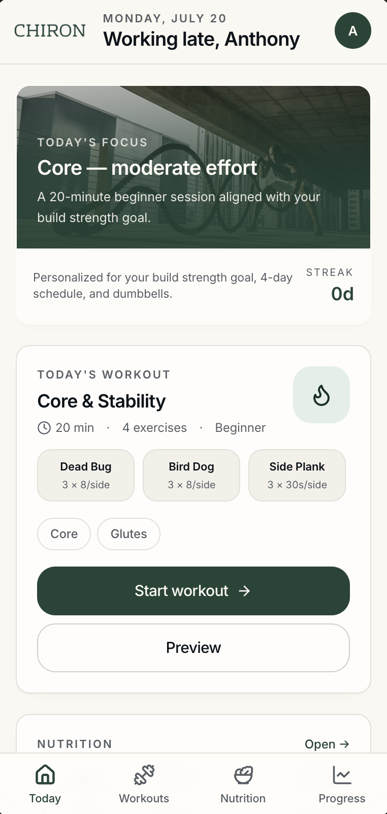
The early version asked people to browse workout programs. The final Today screen recommends a workout based on the information collected during onboarding.

Low-fidelity workout library wireframe
Low-fidelity library
Final Today screen with recommended workout
Final · recommended workout
C
From separate fitness and diet tabs to coordinated guidance

The early version treated exercise and food as two neighboring areas. The final design connects workout demands with meal and macro guidance.

Low-fidelity separate diet tab wireframe
Low-fidelity diet tab
Final Today nutrition guidance connected to the workout plan
Final · coordinated guidance
D
From basic statistics to progress with an explanation

The original schedule screen listed calories, steps, and placeholder statistics. The final progress screen adds a plain-language insight to explain what changed and what the user should do next.

Low-fidelity stats wireframe
Low-fidelity stats
Final progress screen with plain-language insight
Final · progress with insight
07 — The final onboarding flow

Breaking one long survey into decisions people can answer.

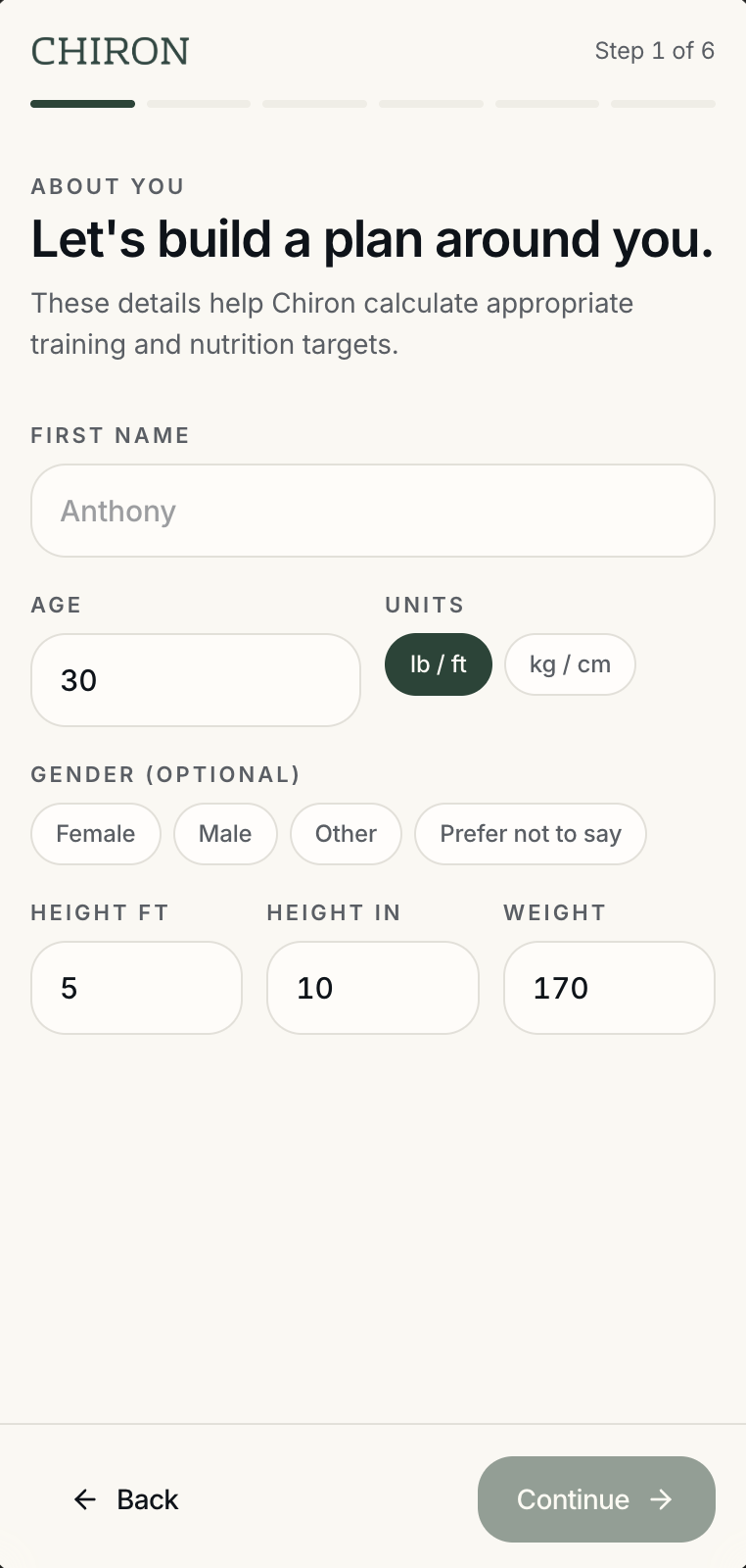
A welcome screen, then six short question steps, then one personalized plan. Each step asks for one kind of decision.
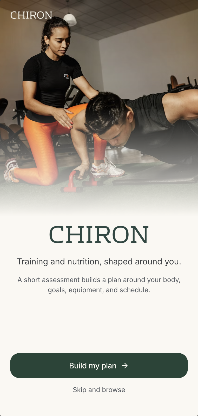
Welcome screen: training and nutrition shaped around you, with Build my plan and Skip and browse actions
Welcome. Personalization is offered, not forced.
Personal information step: age, units, optional gender, height, and weight
Personal information. Collect only what the plan needs.
Fitness goal step: choose one primary goal, with optional secondary goals
Fitness goal. Establish one primary outcome.
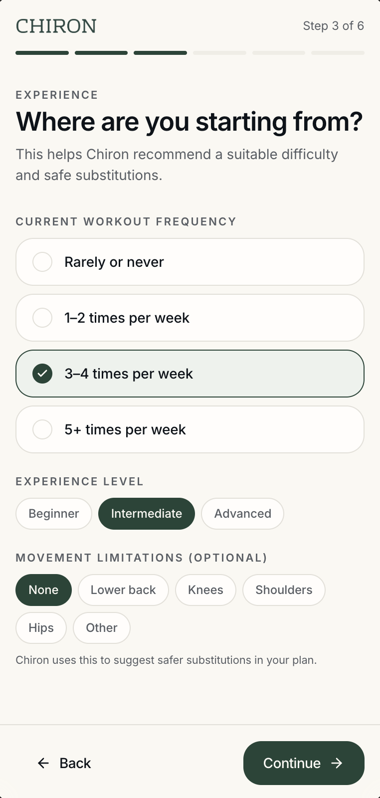
Experience step: workout frequency, experience level, and optional movement limitations
Experience. Match difficulty and substitutions to the person.
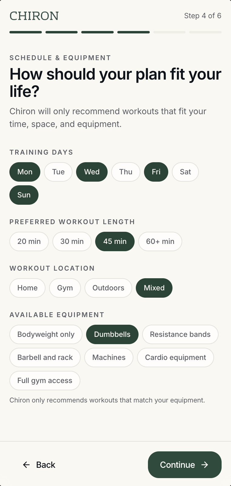
Schedule and equipment step: training days, workout length, location, and available equipment
Schedule & equipment. Recommend only workouts that fit real constraints.
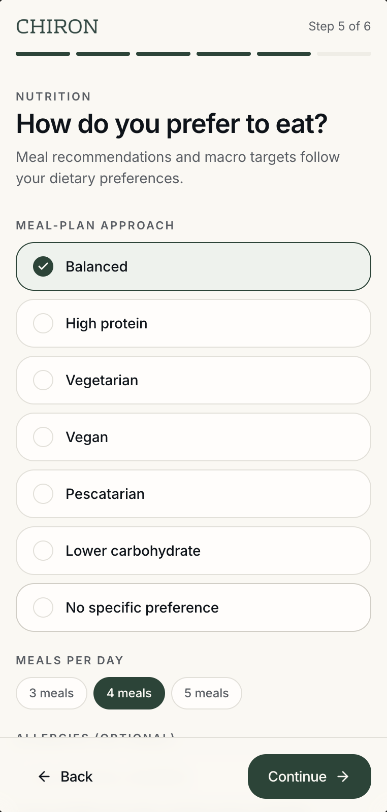
Nutrition step: meal-plan approach and meals per day
Nutrition. Connect food preferences and meal frequency to the same plan.
Then · Personalized plan The six answers turn into one coordinated starting point — the Today screen, where the plan actually lives.
AProgress stays visible. A step indicator runs through onboarding so people always know how much is left.
BOne category per screen. Details, goal, experience, schedule, nutrition — nothing mixes two kinds of decision.
CSelected answers stay clear. Chosen options keep a fill and a check before the user continues.
08 — The Today experience

One screen answers: what should I do today?

Today pulls the plan together in one place: the day's focus, one recommended workout, an exercise preview, a nutrition target, the next meal, hydration, and weekly consistency.
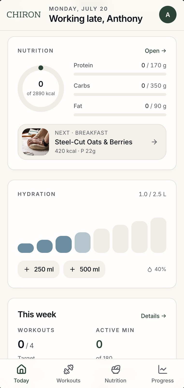
Chiron Today: daily focus card, today's recommended workout with duration and exercise chips, and Start workout
Chiron Today, nutrition half: calorie and macro targets, the next meal, hydration, and weekly summary
What Today connects
AThe recommendation connects back to the goal chosen during onboarding.
BDuration and equipment reflect the schedule and constraints entered earlier.
CWorkout and meal guidance appear together instead of in separate products.
09 — The workout flow

Making the next workout easy to understand and start.

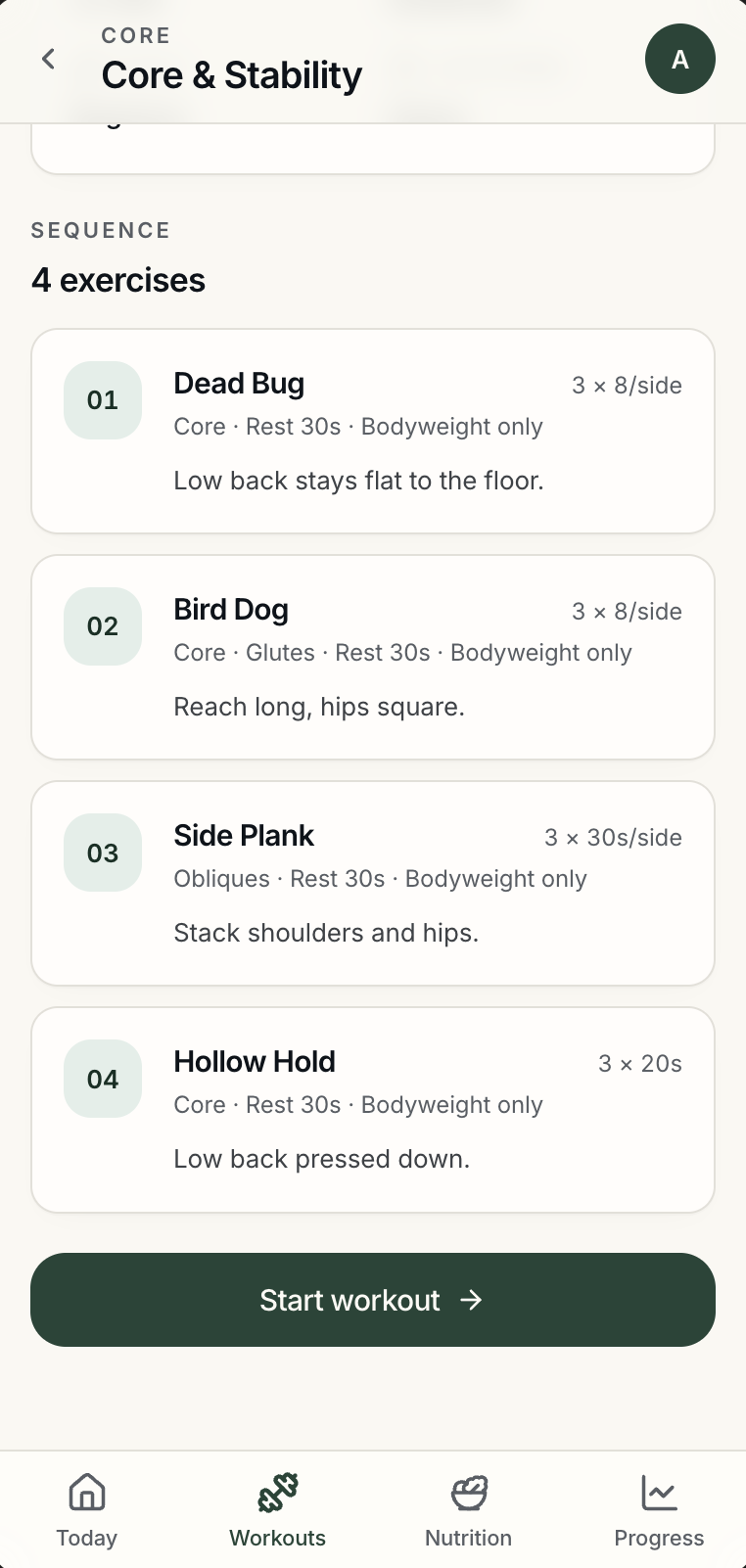
From Today to workout details to the exercise sequence to start — each screen answers a question that would otherwise become a reason not to begin.
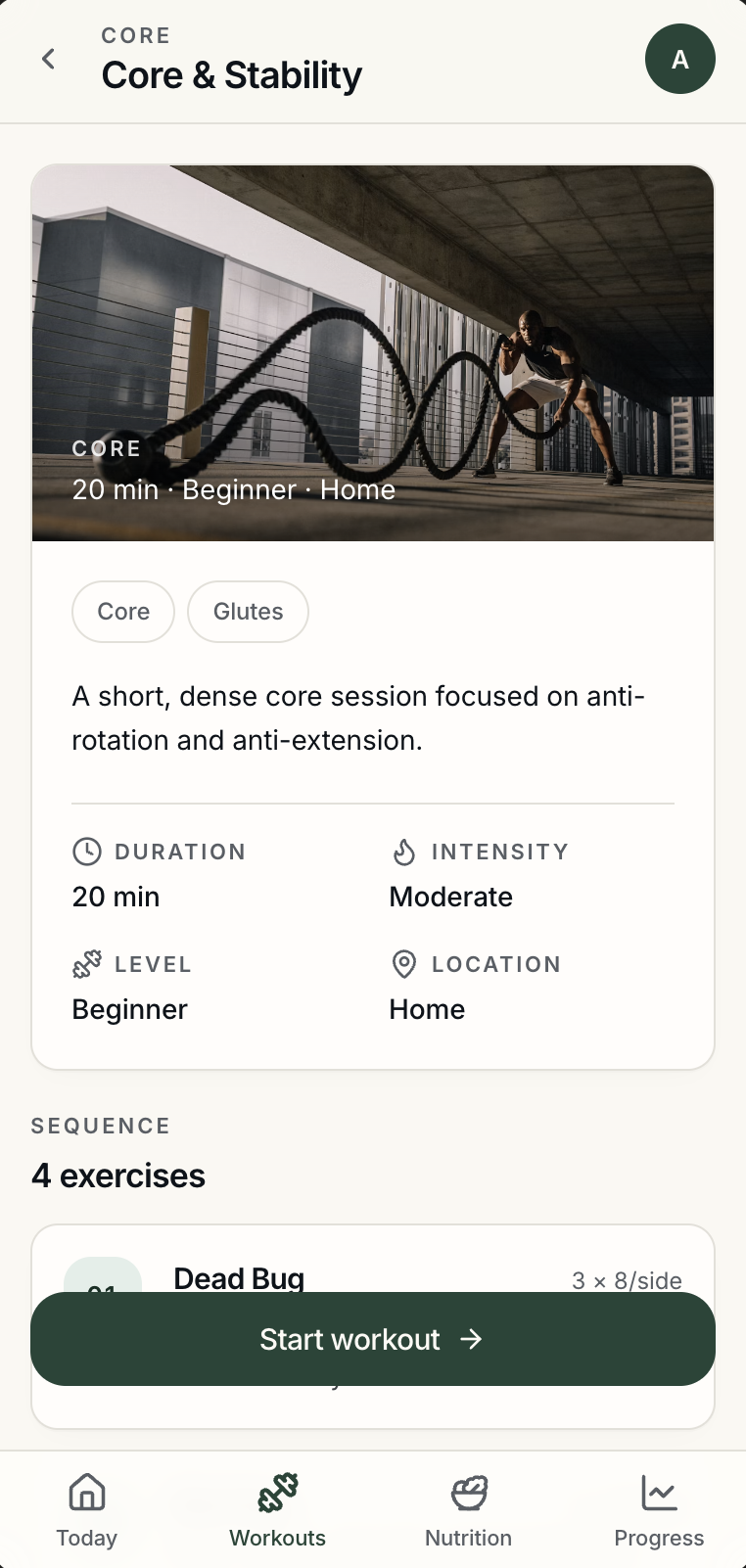
Workout detail: hero image, muscle groups, description, and duration, intensity, level, and location
Exercise sequence: numbered exercise cards with sets, reps, rest, equipment, and short form cues, above Start workout
Five questions the flow answers
1Duration, level, intensity, and location appear before starting.
2The exercise order is already decided.
3Sets, reps, rest time, and equipment are visible on each exercise.
4Movement guidance is written in short, readable language.
5The user can preview the session before committing.

The goal was to remove the small questions that often become reasons not to begin.

10 — Nutrition

Meal guidance that supports the workout plan.

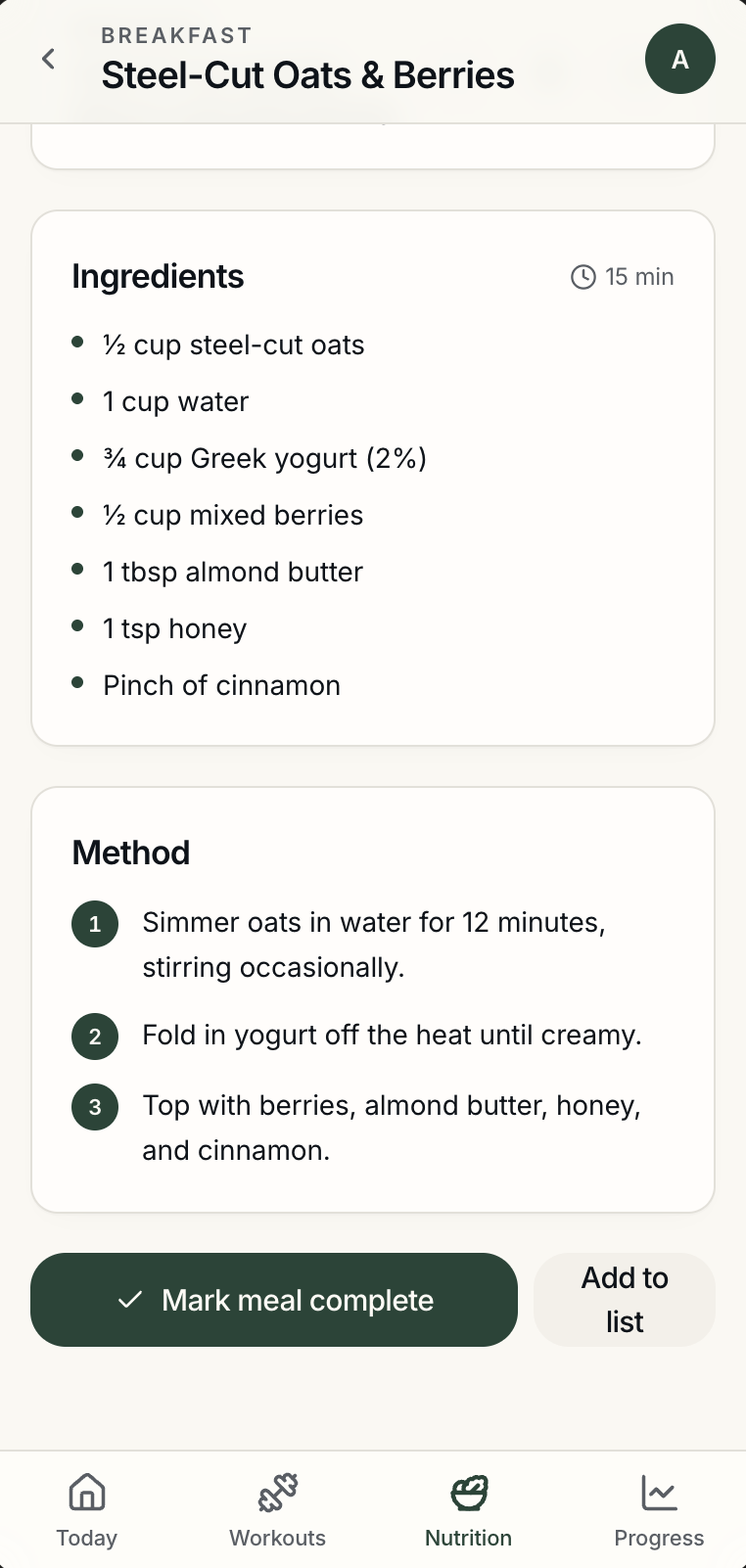
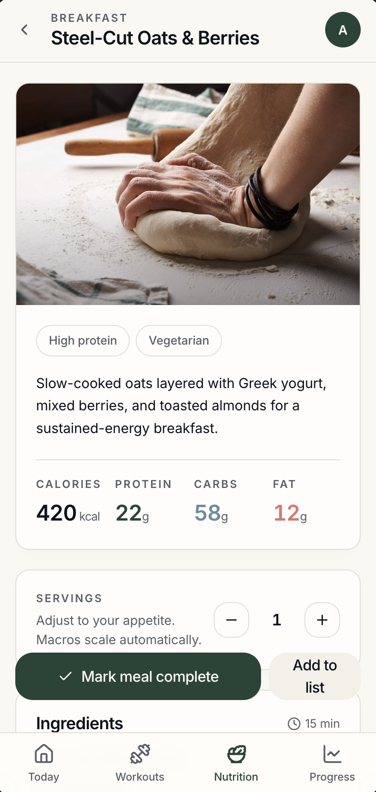
Meals are selected to support the same goals as the workout plan. Calories and macros stay visible, and users can open recipes, adjust servings, complete a meal, or swap one.
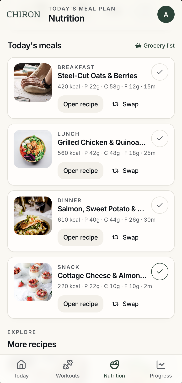
Today's meal plan: breakfast, lunch, dinner, and snack cards with macros and Open recipe and Swap actions
Recipe detail: dietary tags, calorie and macro facts, and serving adjustment with automatic macro scaling
Recipe ingredients and method, with Mark meal complete and Add to list actions
AOne daily list. All of the day's meals are visible in one place.
BNutrition up front. Calories and macros appear before opening a recipe.
CSwap keeps the target. Swapping a meal offers flexibility without discarding the plan.
11 — Progress

Progress should explain what the numbers mean.

The screen opens with a short written insight, then the evidence: workout consistency, active minutes, adherence, weight trend, weekly training volume, personal records, and a goal forecast.
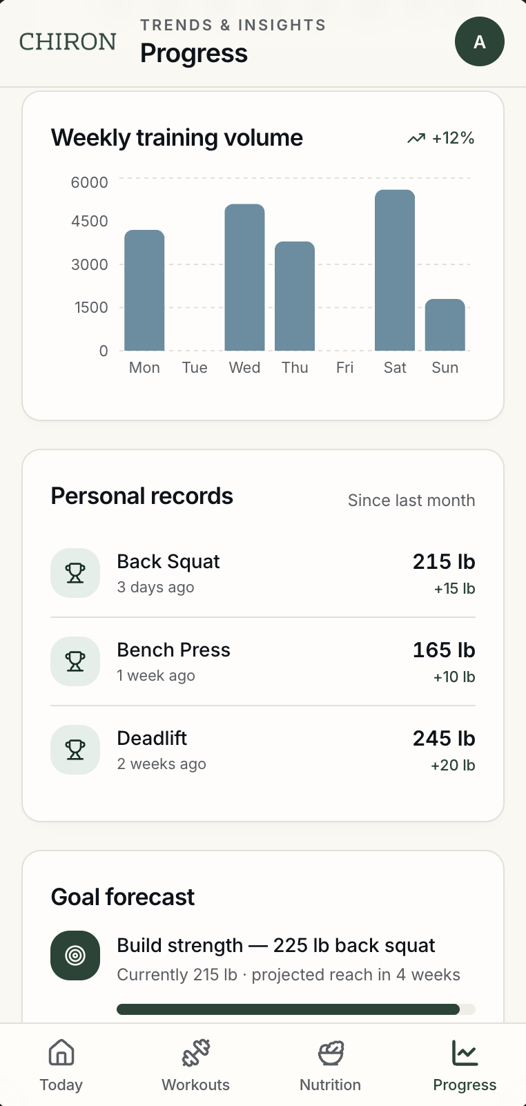
Progress: range controls, an insight card, workout and adherence stats, and a weight-trend chart Progress continued: weekly training volume, personal records with deltas, and a goal forecast
Four questions every visit answers
What changed?Weight trend, volume, and personal records make movement visible.
Why does it matter?The insight card ties the numbers to the user's goal in one sentence.
Am I moving toward my goal?The goal forecast shows current position against the target.
What should I do next?The insight points toward the next step rather than leaving it open.
12 — My role on the team

Leading the interface design within a four-person team.

Chiron was created by a four-person team. My role was Lead UI Designer. I focused on shaping the visual direction and helping the product feel consistent across onboarding, workouts, nutrition, scheduling, and progress. We used Miro to organize ideas and Figma to design and develop the interface.

I ledThe interface design and visual consistency across the whole product.
We did togetherSix user interviews, the survey, and the product direction, organized in Miro.
ToolsFigma for design, Miro for organizing ideas.
13 — Reflection

What I learned from designing Chiron.

Research changed the problem. We began with workout and diet features, but the interviews showed that time, consistency, and decision-making were just as important.

Personalization requires clear questions. The quality of the plan depended on asking for goals, experience, schedule, equipment, and food preferences in a way that did not feel overwhelming.

Fitness and nutrition made more sense together. Treating them as one daily experience created a clearer reason for the product to exist.

UI consistency mattered across a large flow. As Lead UI Designer, I learned how important it was to make onboarding, recommendations, tracking, and planning feel like parts of the same product.

← Back to all work