21 Urban
Designing a connected furniture-shopping experience — from showroom inspiration to customized quote.
21 Urban is a furniture and home-décor brand in Taipei specializing in curated and customizable pieces. Its customers rarely buy the way ecommerce assumes: they gather inspiration in the showroom, compare several pieces, and need consultation or a formal quote before committing.
This project connected the physical showroom with a digital experience built around that reality — product discovery, a quote list that works like a contextual cart, customization requests, and a consultation path for customers who want guidance first.
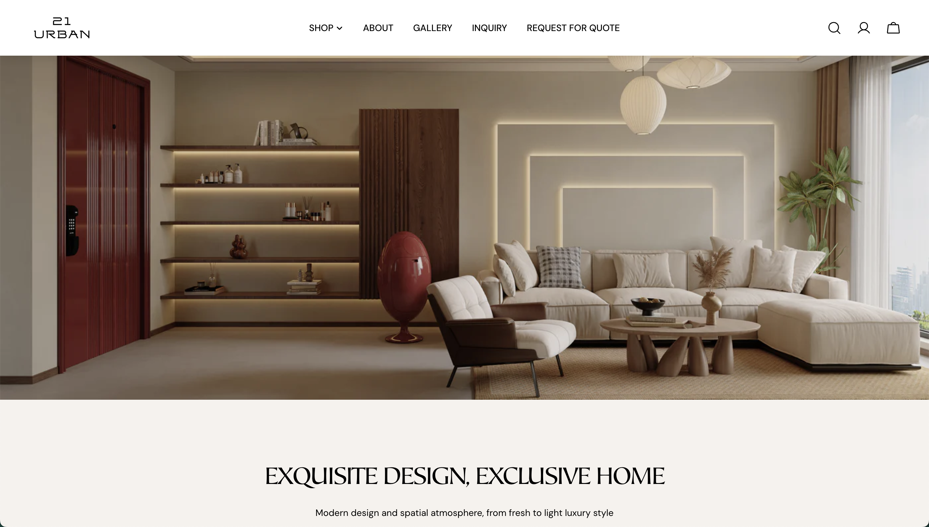
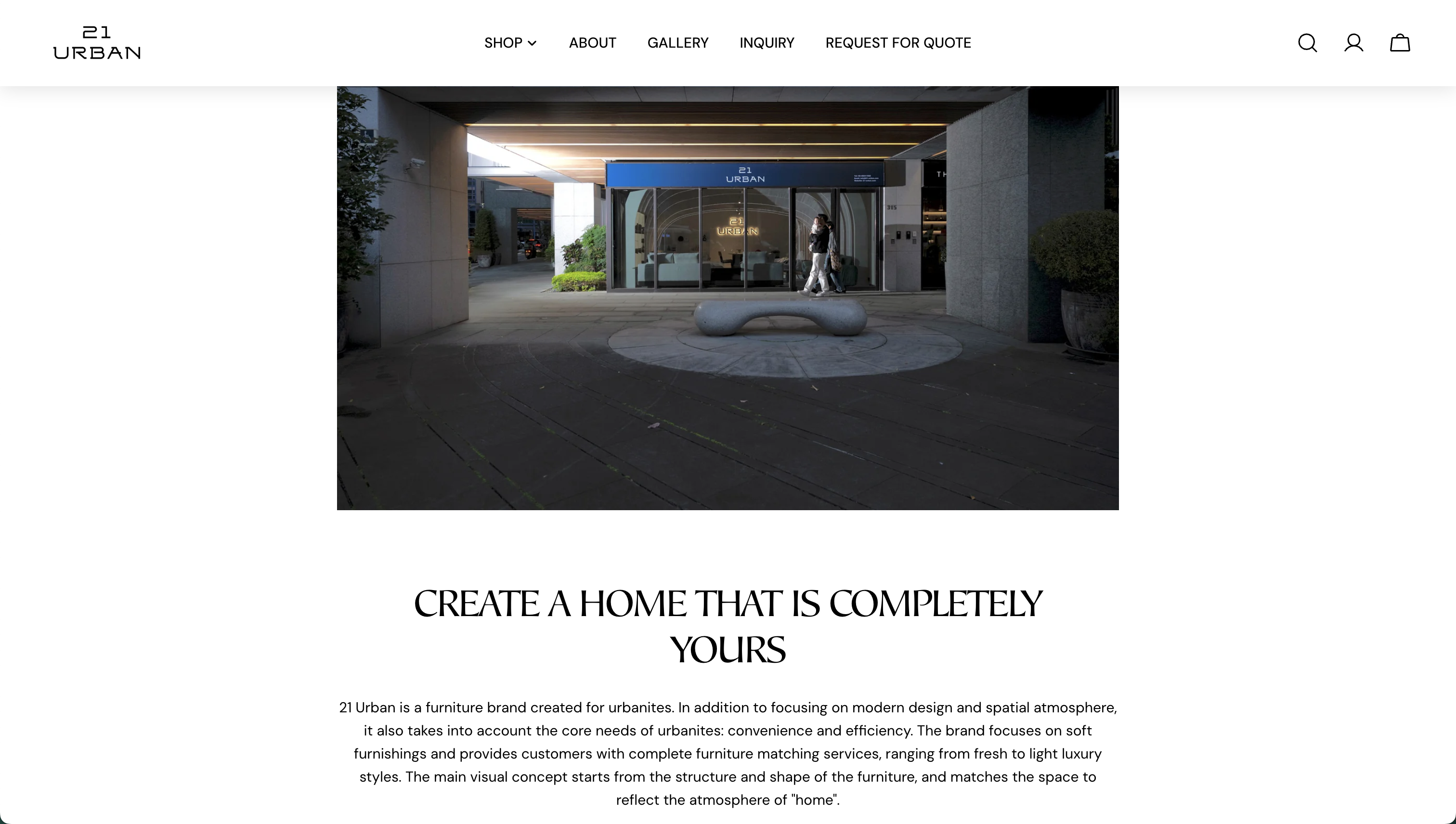
The live 21 Urban homepage — a warm, editorial brand surface that had to lead somewhere more useful than a contact form.
Standard checkout doesn't fit customizable, high-consideration furniture.
A $46,500 bed frame is not an impulse add-to-cart. The final price often depends on dimensions, finishes, quantities, and delivery — and most customers have questions before they'll commit. The default answer, a generic contact form, breaks the journey at exactly the wrong moment:
The decisions a customer actually makes
Instead of mapping features, I mapped the decision sequence of a high-consideration furniture purchase. Each decision implies an interface the site had to provide:
From first visit to actionable inquiry
"The quote request should behave like a contextual shopping cart — not a disconnected contact form."
Preserving product context lets customers collect items first and explain their project once. The business, in turn, receives an inquiry with products, quantities, and prices already attached — something it can actually quote against.
One spine, two entry points, one exit
Every path — browsing or showroom inspiration — converges on the same quote workspace. Consultation runs beside it for customers who want guidance before selecting anything.
Rules the experience had to obey
The interfaces, annotated
Product discovery
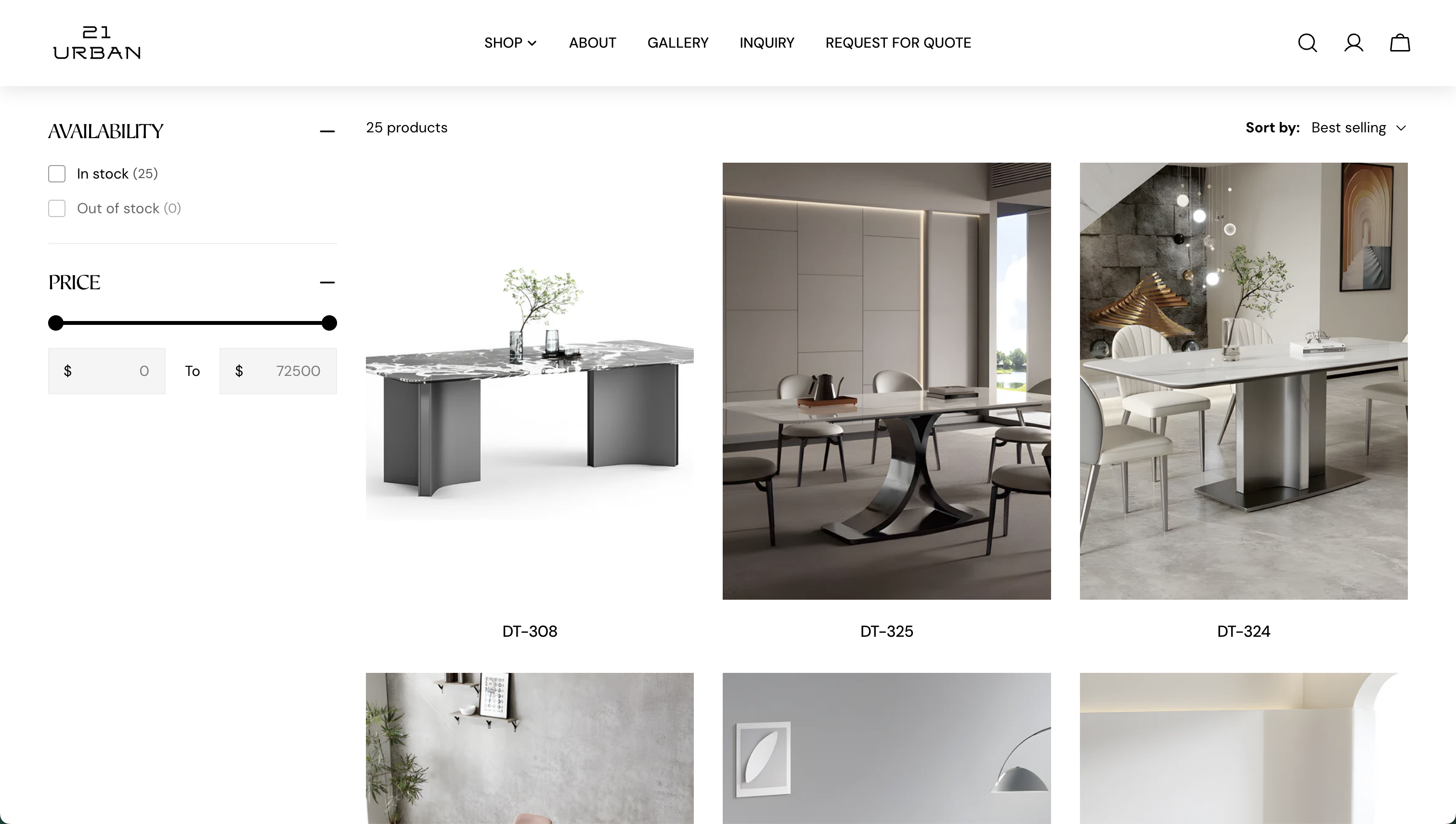
High-consideration browsing needs comparison, not conversion pressure. The listing pairs an availability filter and a full-range price slider ($0–72,500) with large lifestyle photography — each product shown in a styled room, not on white. Sorting defaults to best-selling so first-time visitors see the brand's strongest work before they know what to search for.
Product details
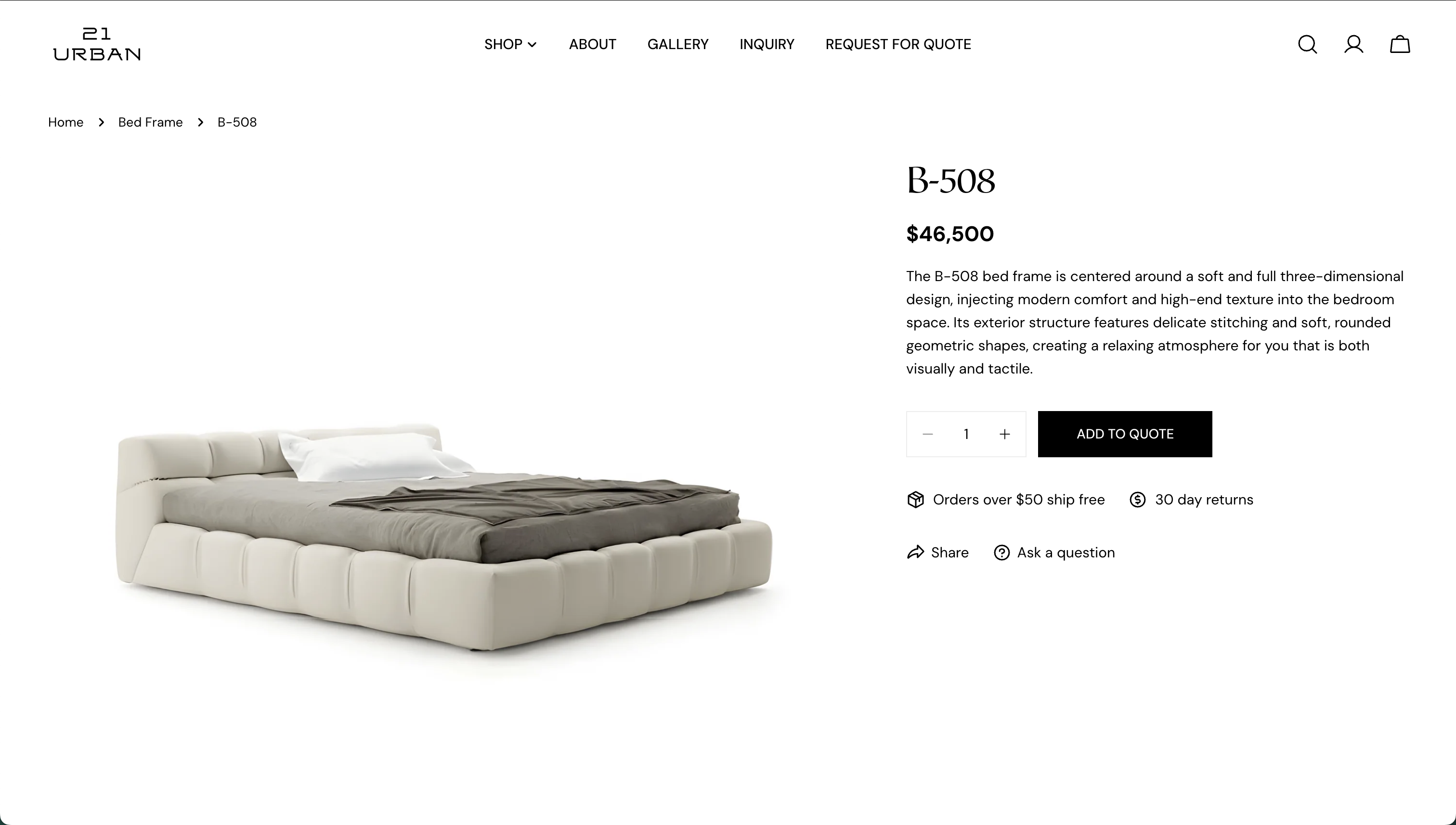
The detail page keeps everything a quote needs on one screen: name, list price, description, and a quantity stepper. The single primary action is Add to Quote — deliberately styled like an add-to-cart button, because it should feel that low-commitment.
"Ask a question" sits beside Share as a secondary path, so pre-purchase clarification never requires leaving the product. The list price stays visible even though final pricing may vary — a reference point beats a "price on request" black box.
The confirmation moment
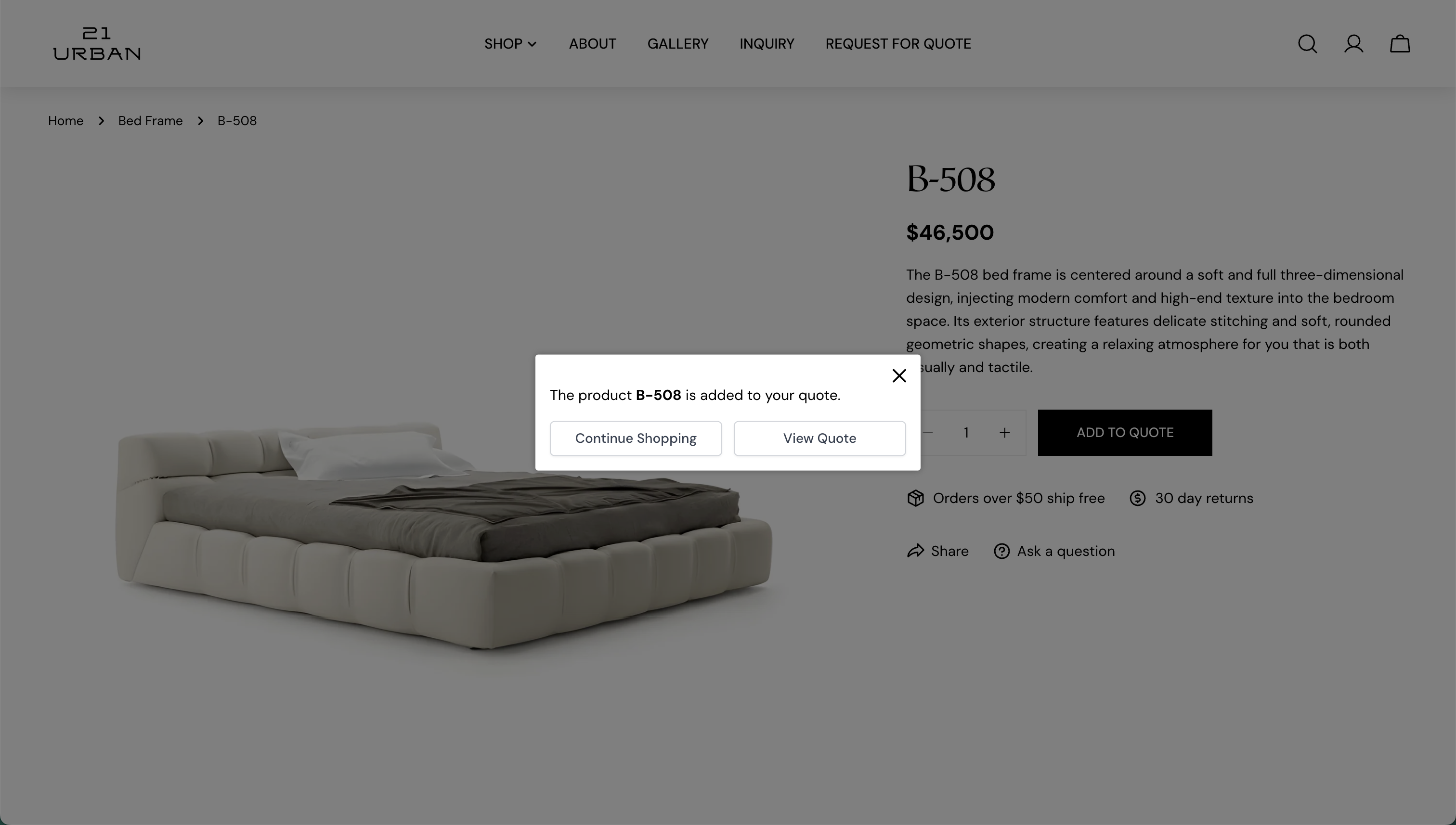
Adding an item opens a small dialog with exactly two choices: Continue Shopping and View Quote. The order matters — continuing comes first, because most furniture projects involve more than one piece and the system shouldn't rush anyone toward the form.
Naming the product in the message ("The product B-508 is added to your quote") confirms the right item landed without making the user open the list to check.
The quote workspace
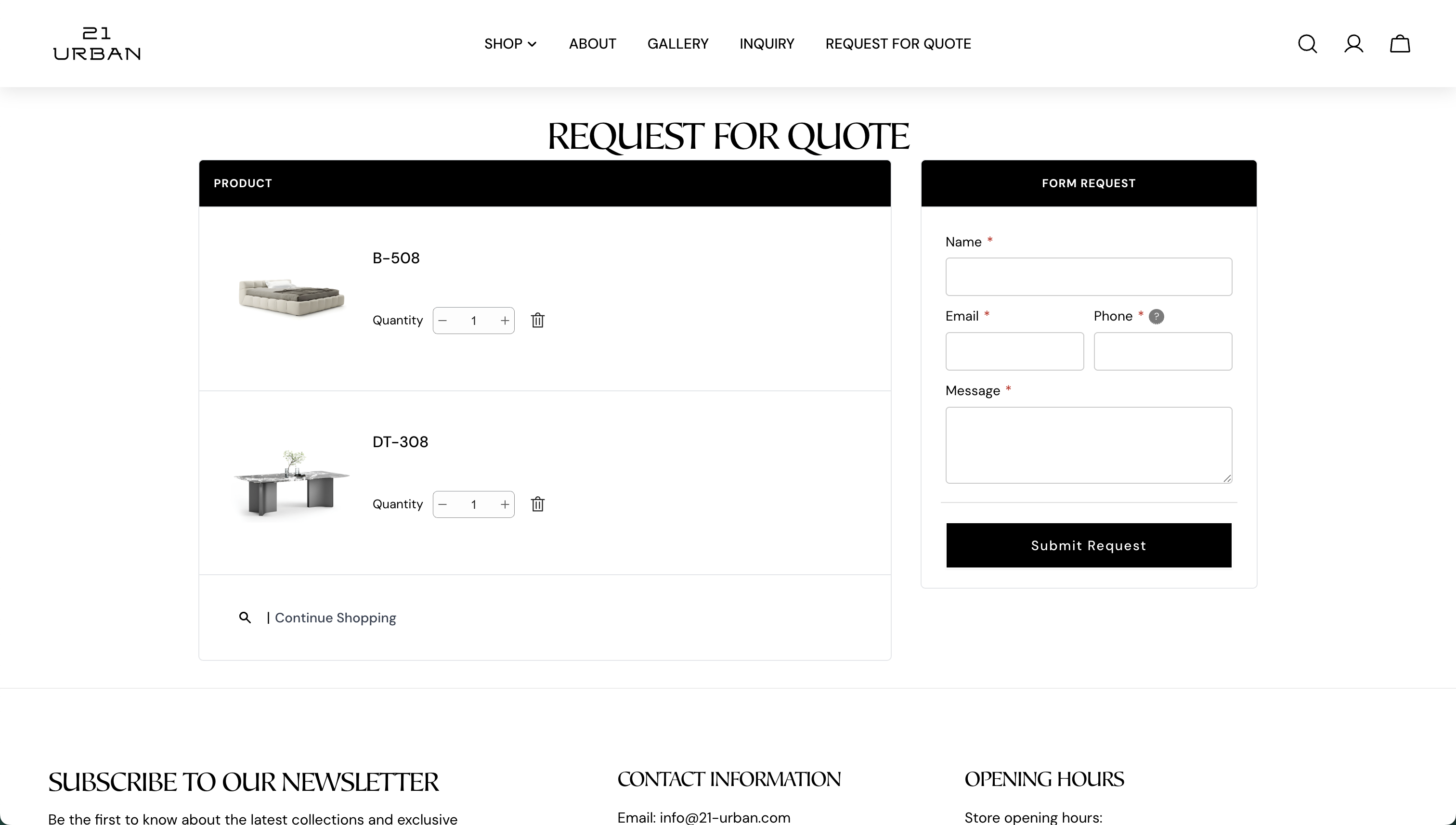
The Request for Quote page is the cart reimagined as an inquiry. Products stay fully visible — image, name, editable quantity, remove — while a single form (name, email, phone, message) sits beside them. The customer describes their project once; the business receives the message with the exact products and quantities attached. A Continue Shopping link keeps the list open-ended until the customer decides it's complete.
Consultation for the undecided
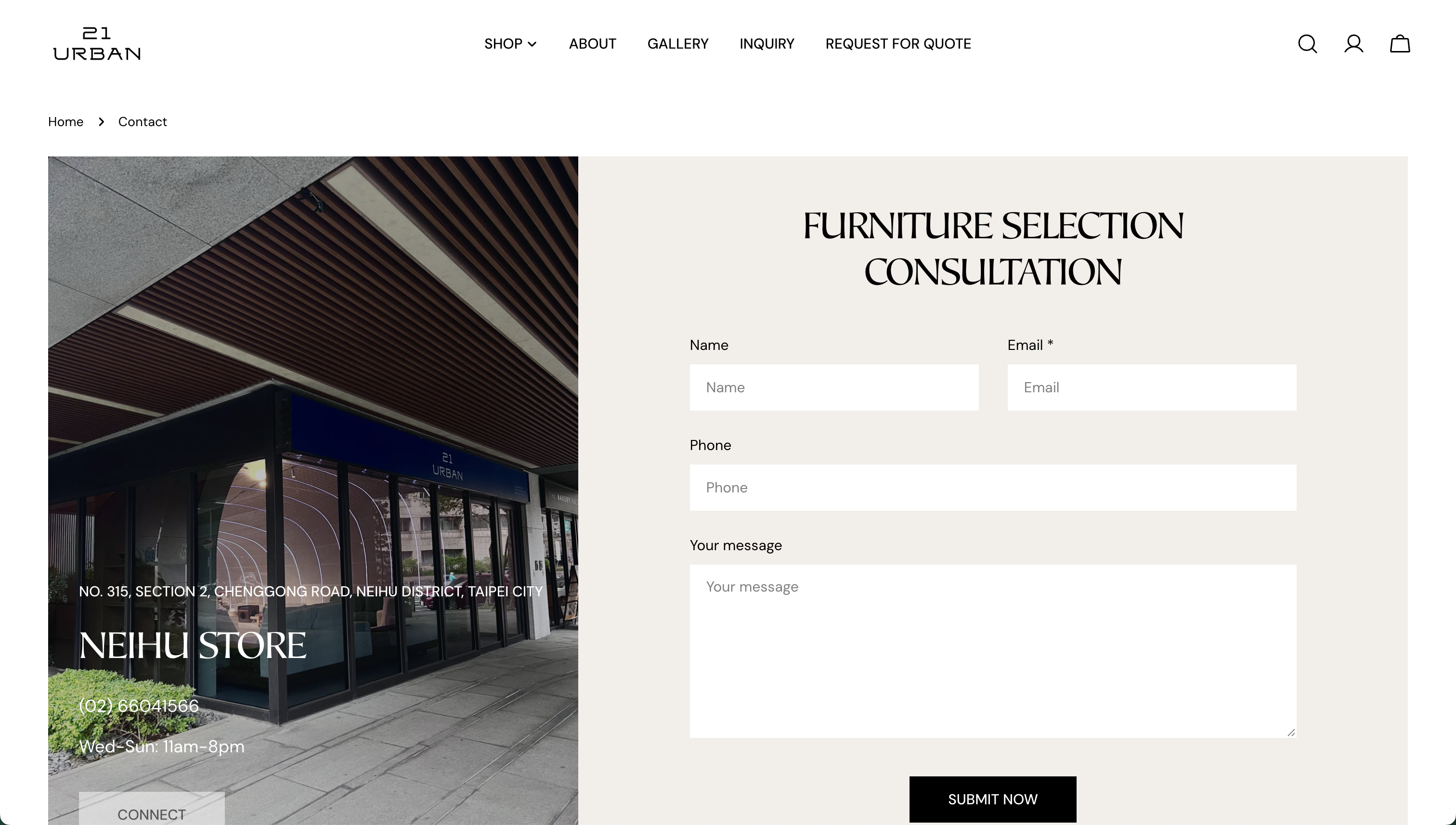
Not every customer arrives with products in mind. The furniture-selection consultation gives them a legitimate path that doesn't pretend to be a quote: a short form paired with the physical store — address, phone, and opening hours — so booking a visit and sending a message are the same gesture.
Keeping this separate from the quote flow protects both: the quote stays product-anchored and actionable, and consultation requests aren't forced into a structure that doesn't fit them.
From showroom to product
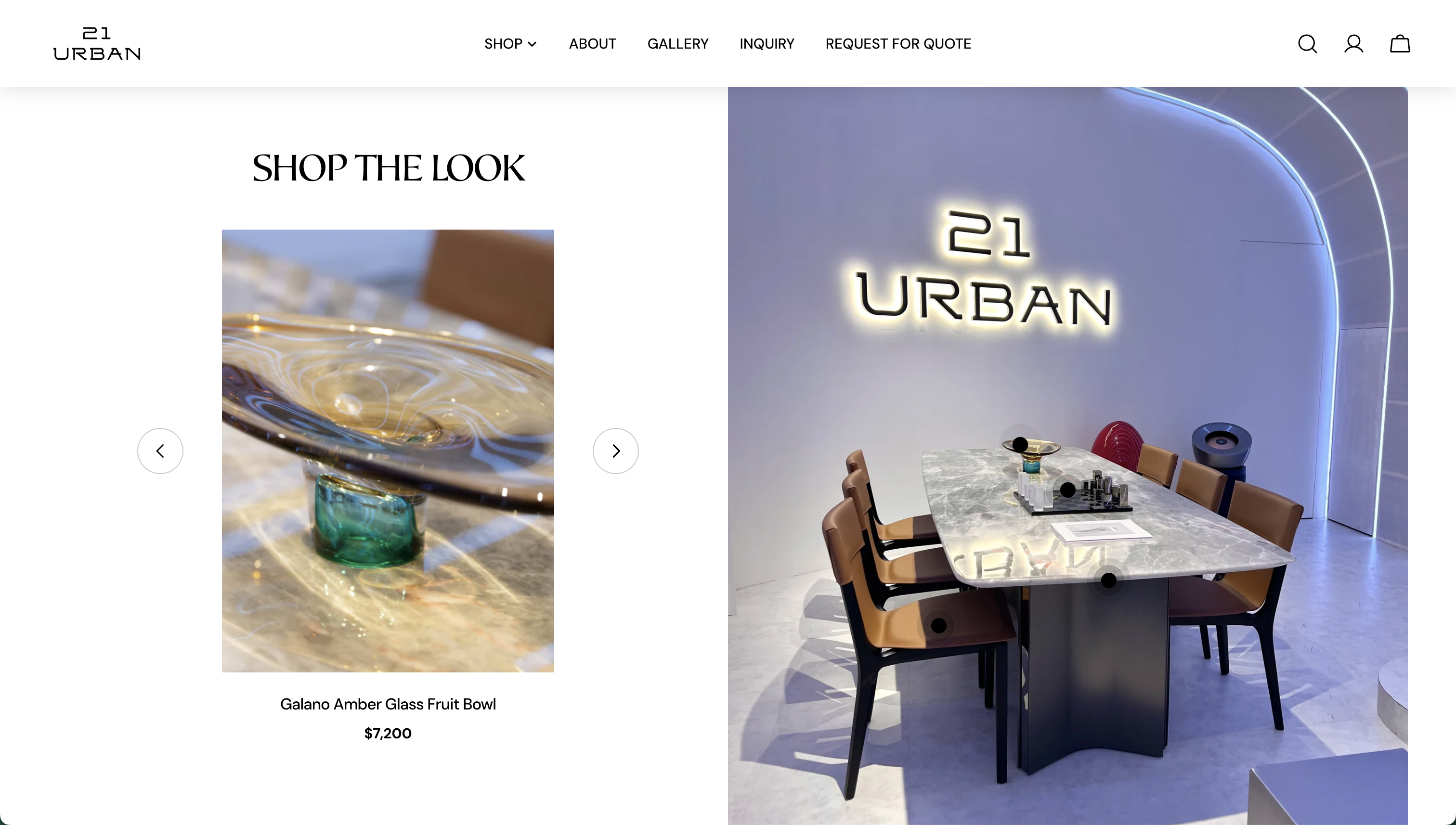
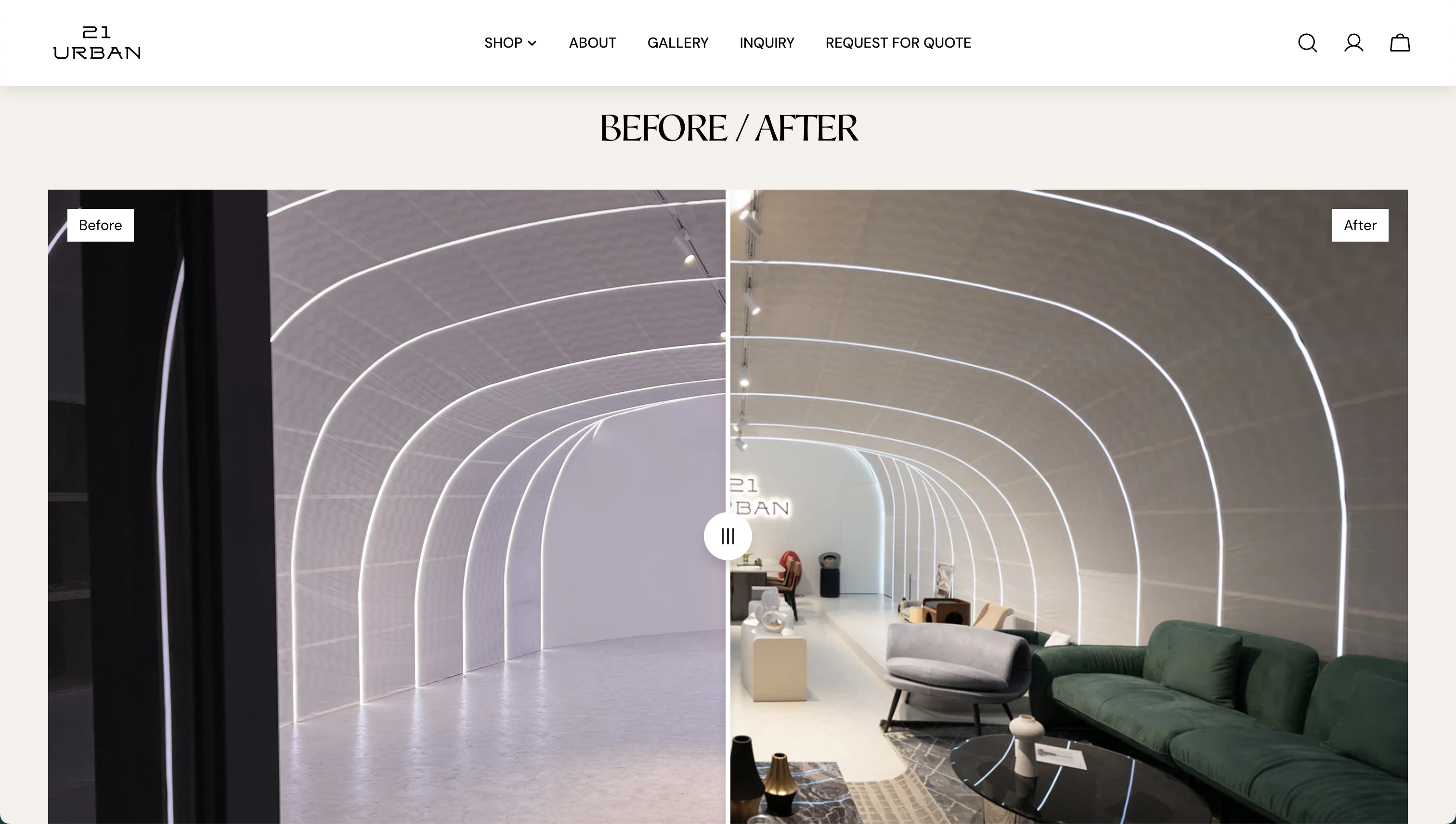
The Neihu showroom is the brand's strongest asset, so the site treats it as an interface. Shop the Look overlays tappable markers on real showroom photography — each marker resolves to a named, priced product. A draggable before / after slider shows the empty space against the furnished one, making the brand's staging capability tangible rather than claimed.
One project, one submission
A customer furnishing a bedroom: discover the brand, browse, review the B-508, add it to the quote, keep shopping, then submit the whole project with one form — or book a consultation instead.
Where the flow will be tested
These are design considerations identified during the project — some handled, some framed as future improvements to validate:
Alongside these: form accessibility (labels, required-field announcement, error recovery) and a mobile layout where the quote list and form stack without losing the product context that defines the flow.
What this project taught me
High-consideration commerce is inquiry design. The most important "conversion" surface isn't checkout — it's the moment a customer decides whether asking a question is worth the effort. Lowering that cost shaped every screen.
Context is the product of the flow. The quote list's real output isn't a form submission; it's a structured, product-anchored conversation starter. Preserving context across steps mattered more than optimizing any single step.
Physical and digital journeys are one journey. Customers don't distinguish "showroom mode" from "website mode." Shop the Look and the before/after slider worked because they treat the showroom as content, not marketing.
Premium identity and usability can share a page. The brand's editorial typography and photography stayed intact; usability came from structure — clear primary actions, named exits, and one form instead of many.
What I'd validate next. Without usability testing, the key hypotheses remain open: whether "Add to Quote" reads as low-commitment to first-time visitors, whether customers understand the quote list is editable, and where the consultation path should surface for undecided browsers. Those are the first questions I'd put in front of real customers.